RSS

Monthly Archives: June 2018

Doing Windows, Part 2: From Interface Manager to Windows

Bill Gates was as aware as everyone else of the abundant deficiencies of his own company’s hastily procured operating system for the IBM PC. So, in September of 1981, before the PC had even shipped and just a handful of months after VisiCorp had started their own similar project, he initiated work at Microsoft on a remedy for MS-DOS’s shortcomings. Initially called the “Interface Manager,” it marks the start of a long, fraught tale of struggle and woe that would finally culminate in the operating system still found on hundreds of millions of computers today.

As the name would imply, the Interface Manager was envisioned first and foremost as a way to make computing easier for ordinary people, a graphical layer to sit atop MS-DOS and insulate them from the vagaries of the command line. As such, it was the logical follow-on to an even older project inside Microsoft with similar goals, another whose distant descendant is still ubiquitous today: Microsoft Multiplan, the forefather of Excel.

In those days, people who had worked at the already legendary Xerox Palo Alto Research Center were traded around the computer industry like the scarce and precious commodity they were, markers of status for anyone who could get their hands on one of them. Thus it could only be regarded as something of a coup when Charles Simonyi came to work for Microsoft on February 6, 1981, after almost a decade spent at PARC. There he had been responsible for a word processor known as Bravo, the very first in history to implement the “what you see is what you get” philosophy — meaning that the text you saw on the monitor screen looked exactly like what would be produced by the printer. When the 32-year-old Hungarian immigrant, debonair and refined, showed his secretary at PARC a snapshot of his soon-to-be boss Bill Gates, 25-going-on-15 and looking like he could really use a shower and a haircut, she nearly fell out of her chair laughing: “Charles, what are you doing? Here you are at the best research lab in the world!” What could he say? A rapidly changing industry could make for strange bedfellows. Simonyi became Microsoft’s First Director of Applications Development.

At Microsoft, he found the Multiplan project, an attempt to make a competitor to VisiCalc, already underway. He pushed hard to turn it into not just another spreadsheet but a different kind of spreadsheet, placing a premium on ease of use in a field of business software already becoming known for its crypticness. For him, ease of use meant augmenting the long lists of command keystrokes with a menu of possibilities that would always be at the user’s fingertips. Simonyi:

I like the obvious analogy of a restaurant. Let’s say I go to a French restaurant and I don’t speak the language. It’s a strange environment and I’m apprehensive. I’m afraid of making a fool of myself, so I’m kind of tense. Then a very imposing waiter comes over and starts addressing me in French. Suddenly, I’ve got clammy hands. What’s the way out?

The way out is that I get the menu and point at something on the menu. I cannot go wrong. I may not get what I want — I might end up with snails — but at least I won’t be embarrassed.

But imagine if you had a French restaurant without a menu. That would be terrible.

It’s the same thing with computer programs. You’ve got to have a menu. Menus are friendly because people know what their options are, and they can select an option just by pointing. They do not have to look for something that they will not be able to find, and they don’t have to type some command that might be wrong.

It’s true that Multiplan’s implementation of menus was a long way from what a modern GUI user might expect to see. For one thing, they were lined up at the bottom rather than the top of the screen. (It would take software makers a surprisingly long time to settle on the topside placement we know today, as evidenced by the menus we saw at the bottom of Visi On’s windows as well in my previous article.) More generally, much of what Simonyi had been able to implement in Bravo on the graphical terminals at Xerox PARC way back in the mid-1970s was impossible on an IBM PC running Multiplan in the early 1980s, thanks to the lack of a mouse and a restriction to text-only display modes. One could only do what one could with the tools to hand — and by that standard, it must be said, Microsoft Multiplan was a pretty good first effort.

Multiplan was released in 1982. Designed to run inside as little as 64 K of memory and ported to several platforms (including even the humble Commodore 64), it struggled to compete with Lotus 1-2-3, which was designed from the start for an IBM PC with at least 256 K. The Lotus product would come to monopolize the spreadsheet market to the tune of an 80-percent share and sales of 5 million copies by the end of the 1980s, while Multiplan would do… rather less well. Still, the general philosophy that would guide Microsoft’s future efforts was there. Their software would distinguish itself by being approachable for the average person. Sometimes this would yield great results, other times it would come off more as a condescending caricature of user-friendliness, but it’s the philosophy that still guides Microsoft’s consumer software to this day.

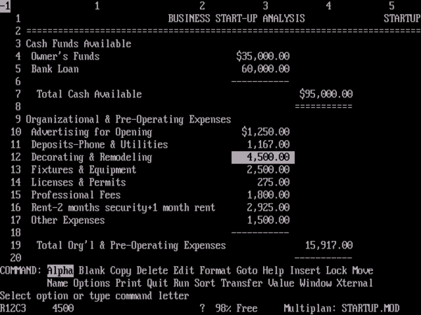
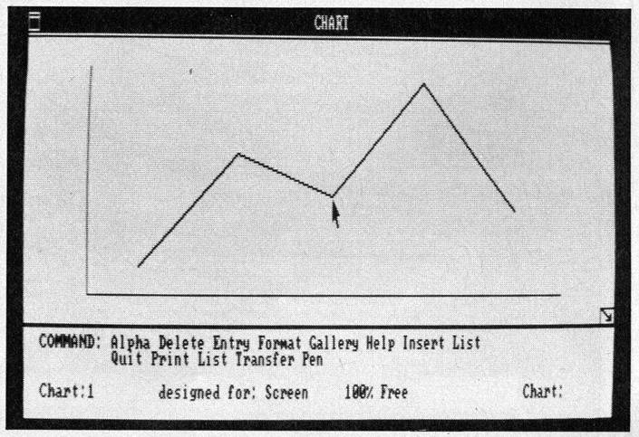
Here we see Microsoft Multiplan in action. Note the two rows of menus along the bottom of the screen; this counted as hugely user-friendly circa 1982.

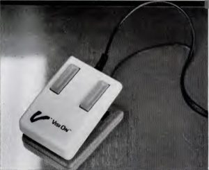
Charles Simonyi left an even bigger mark upon Microsoft’s next important application. Like Multiplan, Multi-Tool Word attempted to compete with the leading application of its type primarily on the basis of ease of use. This time, however, the application type in question was the word processor, and the specific application in question was WordStar, a product which was so successful that its publisher, MicroPro International, had gross sales that exceeded Microsoft’s as late as 1983. Determined to recreate what he had wrought at Xerox PARC more exactly than had been possible with Multiplan, a project he had come into in the middle, Simonyi convinced Microsoft to make a mouse just for the new word processor. (“The mouse,” InfoWorld magazine had to explain, “is a pointing device that is designed to roll on the desktop next to the keyboard of a personal computer.”)

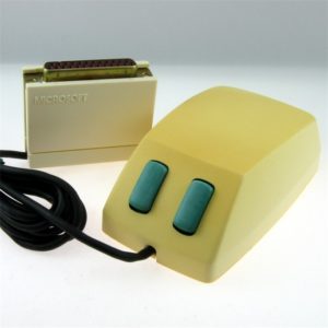
The very first Microsoft mouse, which retailed for $195 in 1983.

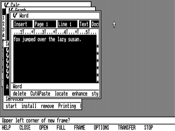
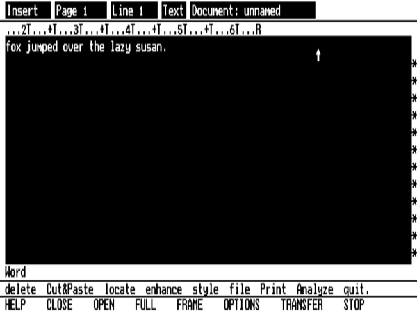
Debuting in May of 1983, in many ways Multi-Tool Word was the forerunner of the operating environment that would come to be known as Microsoft Windows, albeit in the form of one self-contained application. Certainly most of the touted advantages to a GUI environment were in place. It implemented windows, allowing multiple documents to be open simultaneously within them; it utilized the mouse if anything more elegantly than the full-blown GUI environment Visi On would upon its debut six months later; it could run in graphical mode, allowing it to display documents just as they would later appear on the printer; it did its best to duplicate the interface of Multiplan, on the assumption that a user shouldn’t be expected to relearn the most basic interface concepts every time she needs to use a new application; it had an undo command to let the user walk back her mistakes. Unfortunately, it was also, like most early GUI experiments, slow in comparison to more traditional software, and it lacked such essential features as a spell checker and a mailing-list manager. Like Multiplan, it would have a hard time breaking through in one of the most competitive segments of the business-software market, one which was dominated first by the more powerful WordStar and then by the still more power-user-friendly WordPerfect. But, once again, it gave a glimpse of the future of computing as Microsoft envisioned it.

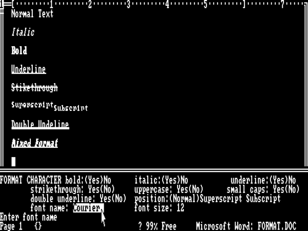
Multi-Tool Word. Here someone is using the mouse to create a text style. Note the WYSIWYG text displayed above.

Even as these applications were being developed at Microsoft, work on the Interface Manager, the software designed to integrate all of their interface enhancements and more into a non-application-specific operating environment, was continuing at its own pace. As usual with such projects, the Interface Manager wound up encompassing far more than just a new interface. Among other requirements, Gates had stated that it had to introduce a system of drivers to insulate applications from the hardware, and that it had to expose a toolkit to application programmers that was far larger and richer than MS-DOS’s 27 bare-bones function calls. Such a toolkit would allow programmers to make diverse applications with a uniform look and feel, thus delivering on another of the GUI’s most welcome promises.

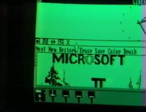
This is one of a series of screenshots, published in the December 1983 issue of Byte Magazine, which together may represent the oldest extant evidence of Microsoft Windows’s early appearance. Note in particular the menus at the bottom of the screen. Oddly, a much more mature version of Windows, with menus at the top of the individual windows, was demonstrated at the Comdex trade show which began on November 23, 1983. Despite the magazine’s cover date, one therefore has to assume that these screenshots are older — probably considerably older, given how dramatic the differences between the Windows demonstrated at Comdex and the one we see here really are.

In early 1983, Bill Gates and a few colleagues met with IBM to show them their Interface Manager in progress. They had expected a thrilled reception, expected IBM to immediately embrace it as the logical next stage in the two companies’ partnership. What they got was something much different. “They thought it was neat stuff,” recalls Gates’s right-hand man Steve Ballmer, “but they said, ‘We have this other thing we are pretty excited about.'” IBM, it seemed, must be working on an extension to MS-DOS of their own. This unsatisfying and, from Microsoft’s perspective, vaguely alarming meeting heralded the beginning of a new, far less trusting phase in the two companies’ relationship. The unlikely friendship between the young and freewheeling Microsoft and the middle-aged and staid IBM had spawned the IBM PC, a defining success for both companies. Now, though, it was entering a much more prickly phase.

IBM had been happy to treat this scruffy kid named Bill Gates almost as an equal partner as long as their first general-purpose microcomputer remained nothing more than a marketplace experiment. Now, though, with the IBM PC the first bullet item on their stock reports, the one exploding part of an otherwise fairly stagnant business, they were beginning to wonder what they had wrought when they signed that generous deal to merely license MS-DOS from Microsoft rather than buy it outright. Gates had already made it clear that he would happily license the same operating system to others; this, combined with the open architecture and easy-to-duplicate commodity hardware of the IBM PC itself, was allowing the first of what would soon be known as the “PC clones” to enter the market, undercutting IBM’s prices. IBM saw this development, for understandable reasons, as a potential existential threat to the one truly exciting part of their business, and they weren’t at all sure whose side Microsoft was really on. The two partners were bound together in a hopeless tangle of contracts and mutual dependencies that could quite possibly never be fully severed. Still, there wasn’t, thought IBM, any point in getting themselves yet more entangled. From here on, then, IBM and Microsoft’s relationship would live in an uncertain no man’s land somewhere between partners and competitors — a situation destined to have major implications for the quest to replace MS-DOS with something better.

IBM’s suspicions about Microsoft were probably at least partly justified — Bill Gates’s reputation as a shark whom you trusted at your peril was by no means unearned — but undoubtedly became something of a self-fulfilling prophecy as well. Suddenly aware of the prospect of a showdown between their Interface Manager and whatever IBM was playing so close to the vest, Microsoft began reaching out to the emerging clone makers — to names like Compaq, Zenith, and Tandy — in a far more concerted way. If matters should indeed end in a showdown, these could be the bridges which would allow their system software rather than IBM’s to remain the standard in corporate America.

As if all this wasn’t creating concern enough inside Microsoft and IBM alike, there was also the question of what to make of the Apple Lisa, which had been announced in January of 1983 and would ship in June. The much-heralded first personal computer designed from the ground up for the GUI paradigm had a lot of problems when you looked below the surface. For one thing, it was far too expensive for even the everyday corporate market, what with its price tag of over $10,000. And it suffered from a bad case of over-ambition on the part of its software architects, who had decided to ask its 5 MHz Motorola 68000 processor to run a highly sophisticated operating system sporting virtual memory and cooperative multitasking. The inevitable result was that the thing was slow. A popular knock-knock joke inside the computer industry followed the “Who’s there?” with a fifteen-second pause before a “Lisa” finally came forth. If someone was going to pay over $10,000 for a personal computer, everyone agreed, she was justified in expecting it to run like a Ferrari rather than a Volkswagen bus.

The Lisa GUI, looking and working pretty much the way we still expect such things to look and work today.

When you looked beyond the pricing and performance problems, however, the Lisa was… well, the Lisa was amazing. Apple’s engineering team had figured this whole GUI thing out in a way that no one, not even the demigods at Xerox PARC, had managed to do before. The greatest testament to Apple’s genius today is just how normal the Lisa interface still looks, how easily one can imagine oneself just sitting down and getting to work using it. (Try saying that about any other unfamiliar operating system of this period!) All the stuff we expect is present, working as we expect it to: draggable windows with scroll bars on the side and sizing widgets attached to the corners; pull-down menus up there at the top of the screen; a desktop to function as the user’s immediate workspace; icons representing disks, files, and applications which can be dragged from place to place or even thrown in the trash can; drag-and-drop and copy-and-paste. Parts of all this had appeared before in other products, such as the Xerox Star, but never before had it all come together like this. After the Lisa, further refinements of the GUI would all be details; the really essential, really important pieces were all in place. It instantly made all of the industry’s many other GUI projects, including Microsoft’s, look hopelessly clunky.

Thanks not least to that $10,000 price tag, the Lisa itself was doomed to be a commercial failure. But Apple was promising a new machine for 1984, one which would be cheaper and would employ the same interface without the speed-sapping virtual memory and multitasking. For obvious reasons, the prospect of this next Apple computer, to be called the Macintosh, made plenty of people in the MS-DOS world, among them Bill Gates, very nervous.

One can view much of the history of the personal computer in the United States through the shifting profiles of Bill Gates and Steve Jobs, those two personalities who will always be most identified with a whole era of technology in the public imagination. Just a few years hence from 1983, Jobs would be widely viewed as a has-been in his early thirties, a flighty hippie whom the adults who were now running Apple had wisely jettisoned; Gates, on the other hand, would be a darling of Wall Street well on the way to his reputation as the computer industry’s all-powerful Darth Vader. In 1983, however, the picture was very different. Jobs was still basking in the glory of having been one half — and by far the most charismatic half at that — of the pair of dreamers who had supposedly invented the personal computer in that famous Cupertino garage of theirs, while Gates was the obscure head of a rather faceless company whose importance was understood only by industry insiders. None could foresee the utter domination of virtually all personal computing that would soon be within Gates’s grasp. He was still balanced on the divide between his old way of doing business, as the head of an equal-opportunity purveyor of programming languages and other software to whoever cared to pay for them, and his new, as the supreme leader in the cause of one platform to rule them all under the banner of Microsoft.

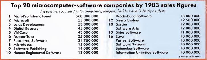
This list of the top software companies of 1983 provides a fascinating snapshot of an industry in rapid transition. VisiCorp, which would easily have topped the list in any of the three previous years, has fallen back to number 5, already a spent force. Lotus, the spreadsheet-making rival responsible for their downfall, will take over the top spot in 1984 and remain there through 1986. The biggest company of all this year is the now-forgotten MicroPro, maker of WordStar, the most popular early word processor; they will be wiped out by WordPerfect, which doesn’t even make this list yet, within a year or two. Finally, note the number of home- and entertainment-software publishers which manage to sneak onto the bottom half of this list. In years to come, the business-software market will continue to explode so dramatically in contrast to a comparatively slow-growing home-computing software market as to make that a thing of the past.

So, Jobs still had the edge on Gates in lots of ways in 1983, and he wasn’t afraid to let him know. He expected Microsoft to support the Macintosh in the form of application software. Specifically, he expected them to provide a spreadsheet, a business-graphics application, and a database; they’d signed a contract to do so, and been provided with their first extremely crude prototype of the new machine in return, back in January of 1982. According to Mike Murray, the Mac’s first marketing manager, Jobs would call Gates up and hector him in a way that no one would have dared talk to the Bill Gates of just a few years later: “You get down here right now. I don’t care what your schedule says. I want you down here tomorrow morning at 8:30 and I want you to tell me exactly what you’re doing [for the Macintosh] at Microsoft.”

For his part, Gates was willing to play the role of Jobs’s good junior partner, just as he had played the same role so dutifully for IBM, but he never lost sight of the big picture. The fact was that when it came to business sense, the young Bill Gates was miles ahead of the young Steve Jobs. One can’t help but imagine him smiling to himself when Jobs lectured him on how he should forget about MS-DOS and the rest of the system-software business, how application software was where the money was really at. Gates knew something which Jobs had apparently yet to realize: if you control the operating system on people’s computers, you can potentially control everything.

Still, Jobs was aware enough of business realities to see an environment like the Interface Manager, available on commodity clone hardware much cheaper than the Macintosh, as a significant threat. He reminded Gates pointedly of language in the January 1982 contract between the two companies which prohibited Microsoft from using knowledge gained of the Macintosh in competing products for other platforms. Gates respectfully but firmly held his ground, not even precisely denying that insights gained from the Macintosh might find their way into the Interface Manager but rather saying that the “competing products” mentioned in the contract would naturally have to mean other spreadsheets, business-graphic applications, or databases — not full-fledged operating environments. Further, he pointed out, the restrictions only applied until January 1, 1984, or the first shipment of the Macintosh, whichever came first. By the time the Interface Manager was actually ready to sell, it would all be a moot point anyway.

It was at about this time that the Interface Manager became suddenly no longer the Interface Manager. The almost aggressively generic name of “Windows” was the brainchild of a new marketing manager named Rowland Hanson, who was just 31 years old when he came to Microsoft but had already left his stamp on such brands as Betty Crocker, Contadina, and Neutrogena. At his first interview with Bill Gates, the latter’s words immediately impressed him:

You know, the only difference between a dollar-an-ounce moisturizer and a forty-dollar-an-ounce moisturizer is in the consumer’s mind. There is no technical difference between moisturizers. We will technically be the best software. But if people don’t believe it or people don’t recognize it, it won’t matter. While we’re on the leading edge of technology, we also have to be creating the right perception about our products and our company, the right image.

Who would have thought that this schlubby-looking nerd understood so much about marketing? Having taken the interview on a lark, Hanson walked out of Gates’s office ready to help him create a new, slicker image for Microsoft. He knew nothing whatsoever about computers, but that didn’t matter. He hadn’t known anything about moisturizers either when he went to work for Neutrogena.

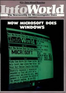
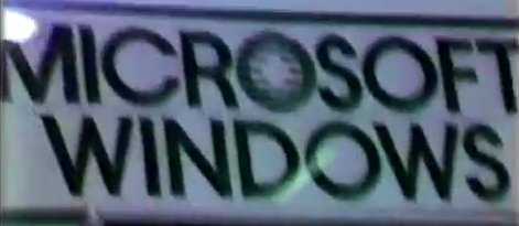
Hanson devised the approach to product branding that persists at Microsoft to this day. Each product’s name would be stripped down to its essence, creating the impression that it was the definitive — or the only — product of its type. The only ornamentation would be the Microsoft name, to make sure no one forgot who made it. Thus Multi-Tool Word, after just a few months on the market under that unwieldy name, now became simply Microsoft Word. If he had arrived just a little earlier, Hanson grumbled, he would have been able to make sure that Multiplan shipped as Microsoft Spreadsheet, and MS-DOS — the software that “tells the IBM PC how to think” in his new marketing line — would have had the first part of the abbreviation spelled out every single time: Microsoft DOS. Luckily, there was still time to save the next generation of Microsoft system software from the horrid name of Interface Manager. It should rather be known simply as Microsoft Windows. “It appeared there were going to be multiple systems like this on the market,” remembers Hanson. “Well, we wanted our name basically to define the generic.” Gates agreed, and one of the most enduring brands in the history of computing was born.

The Windows project had run hot and cold inside Microsoft over the past couple of years in the face of other pressing priorities. Now, though, Gates started pushing hard under the prompting of external developments. The Macintosh was scheduled to make its debut in January of 1984. Just as worryingly, VisiCorp planned to ship Visi On at last before 1983 was up, and had scheduled a big, much-anticipated unveiling of the final product for the Comdex business-computing trade show which would begin on November 23. Determined to avoid the impression that Microsoft was being left behind by the GUI arms race, and even more determined to steal VisiCorp’s thunder, Gates wanted a Windows unveiling before Comdex. To help accomplish that, he hired another refugee from Xerox named Scott MacGregor and put him in charge of the project’s technical architecture. At 26 years old, MacGregor was a little too young even by the early-blooming standards of hacker culture to have made a major contribution during the glory days of Xerox PARC, but he had done the next best thing: he had designed the windowing system for the Star office workstation, the only tangible commercial product Xerox themselves ever developed out of all the work done with mice and menus at PARC. Other Xerox veterans would soon join MacGregor on the Windows project, which spent the late summer and early autumn of 1983 in a mad scramble to upstage its various competitors.

On November 10, at a lavish event inside New York City’s posh Helmsley Palace Hotel, Microsoft officially announced Windows, saying it would be available for purchase by April of 1984 and that it would run on a computer without a hard drive and with as little as 192 K of memory — a stark contrast to Visi On’s minimum specification of a hard-drive-equipped 512 K machine. And, unlike under Visi On, all applications, even those not specifically written for Windows, would be able to run in the environment, at least after a fashion. “Misbehaved” programs, as Microsoft referred to what was actually the entirety of the MS-DOS application market at the time of the unveiling, could be started through Windows but would run in full-screen mode and not have access to its features; Windows would effectively shut down when the time came to run such an application, then start itself back up when the user exited. It wasn’t ideal, but it struck most people as an improvement on Visi On’s our-way-or-the-highway approach.

The dirty little secret hiding behind this very first demonstration of Windows was that the only actual Windows application that existed at the time was a little paint program Microsoft’s programmers had put together, along with a few applets like a calendar, a calculator, and an extremely basic text editor. Microsoft had, they claimed, “commitments” from such big players as Lotus, Ashton-Tate, and Peachtree to port their vanilla MS-DOS applications to Windows, but the reality was that none of these took the form of much more than a vague promise and a handshake.

The work Bill Gates had been doing to line up support from the emerging community of clone makers was in plainer evidence. Microsoft could announce that no fewer than 23 of their current MS-DOS licensees had signed up to ship Windows on their machines as well, including names like Compaq, Data General, Hewlett-Packard, Radio Shack/Tandy, Wang, and Zenith. The only important licensee absent from the list was the biggest of them all, IBM — a fact which the business and technology press could hardly fail to notice. Yet the plan was, as Gates didn’t hesitate to declare, to have Windows on 90 percent of all MS-DOS machines by the end of 1984. Where did that leave IBM? Among the trailing 10 percent?

As it happened, Microsoft was still trying to get IBM onboard the Windows train. The day after the big rollout, Gates flew from New York to Boca Raton, Florida, where the division of IBM responsible for their microcomputers was located, and made another pitch. Perhaps he believed that the good press stemming from the previous day’s festivities, which was to be found in the business and technology sections of this day’s newspapers all over the country, would sway them. If so, he was disappointed. Once again, IBM was noncommittal in all senses of the adjective, alluding vaguely to a potential similar product of their own. Then, a few days after Gates left them, IBM announced that they would distribute Visi On through their dealer network. This move was several steps short of anointing it the only or the official GUI of the IBM PC, but it was nevertheless a blessing of a certain type, and far more than IBM had yet agreed to do for Windows. It was becoming abundantly clear that IBM was, at the very least, hedging their bets.

A week later, the Comdex show opened in Las Vegas, with the finished Visi On on public display for the first time. Just a few booths down from that spectacle, Microsoft, still determined to undermine Visi On’s debut, showed Windows as well. Indeed, Windows was everywhere at Comdex; “You couldn’t take a leak in Vegas without seeing a Windows sticker,” remembers one Microsoft executive. Yet the actual product behind all the hype was presented only in the most circumscribed way. Microsoft employees ran through a carefully scripted spiel inside the Windows booth, making sure the public got nowhere close to the controls of the half-finished (at best) piece of software.

Still, Microsoft had some clear advantages to point out when it came to Windows, and point them out they did. For one, there was the aforementioned ability to run — or at least to start — non-Windows applications within the environment. For another, true multitasking would be possible under Windows, claimed Microsoft, not just the concurrently open applications of Visi On. And it would be possible, they said, to write Windows programs on the selfsame Windows computer on which they would run, in contrast to the $20,000 minicomputer one had to buy to develop for Visi On. This led Microsoft to refer to Windows as the open GUI, a system carrying forward the original promise of the personal computer as an anything tool for ordinary users.

In the nuts and bolts of their interfaces as well, the two systems presented contrasting approaches. The Visi On interface strongly resembled something that might have been seen at Xerox PARC in the 1970s, but Windows betrayed the undeniable influence of Apple’s recent work on the Lisa and, as would later become clear, the Macintosh — not hugely surprising, given that Microsoft had been able to follow the step-by-step evolution of the latter since January of 1982, thanks to their privileged position as contracted application developers for the new machine. Windows already seemed to operate a bit more intuitively than the rather awkward Visi On; Microsoft already understood, as their competitor so plainly did not, that a mouse could be used for things other than single clicks.

In other ways, though, Windows was less impressive than Visi On, not to mention the Lisa and Macintosh. And one of these ways was, ironically given the new product’s name, the windows themselves. They weren’t allowed to overlap one another — at all. In what Microsoft spun as the “automatic window layout” feature, sizing one window would cause all of the others to resize and reposition themselves in response. Nor could you freely drag windows around the screen like you could on the Lisa and Macintosh. “It’s the metaphor of the neat desktop,” said Steve Ballmer, spinning like mad. Neat or not, this wasn’t quite the way most people expected a window manager to work — and yet Microsoft would stick with it for a well-nigh absurdly long time to come.

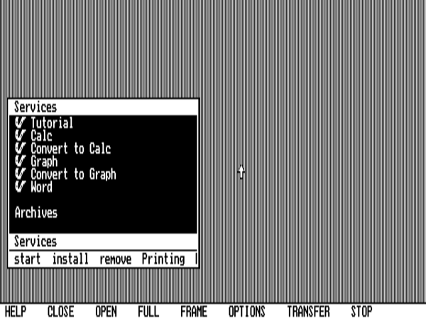
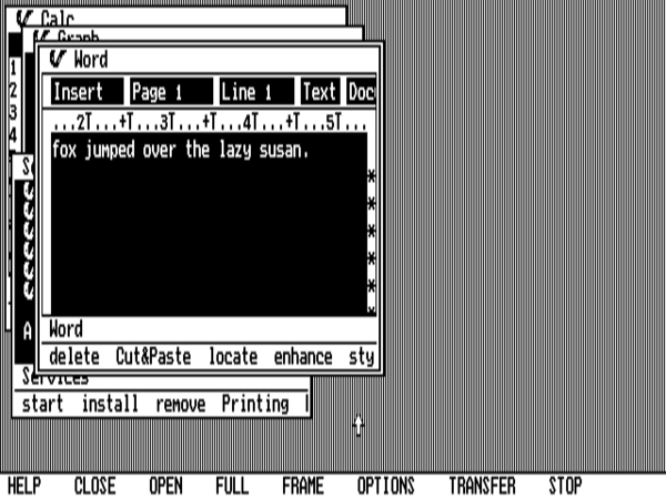
A Quick Tour of Windows as Shown at the 1983 Comdex Show


None other than Dan Bricklin of VisiCalc fame visited the November 1983 Comdex show with a camcorder. The footage he took is a precious historical document, not least in showing Windows in action as it existed at the time of these first public demonstrations. Much must still be surmised thanks to the shaky camerawork and the fact that the public was kept at arm’s length from a far-from-complete piece of software, but we’re very lucky Bricklin and his camcorder were there that day. We learn from his footage that Windows had progressed hugely since the screenshot shown earlier in this article, showing the clear influence of Apple’s Lisa and Macintosh interfaces.

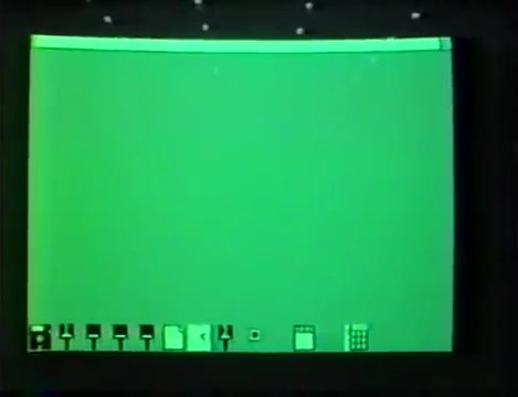
Windows apparently boots up to a blank screen with a row of (non-draggable) icons at the bottom, each representing an installed application.

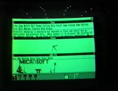
Here a text editor, a clock applet, and a paint program have been opened. Unlike in Visi On and Apple’s GUIs, windows cannot overlap one another. On the other hand, note that the menu bar has been moved to the top of the window, where we expect it to be today. On the other other hand, it appears that the menu still provides single-click options only, not drop-down lists of choices. Note how cluttered the two-line text-editor menu at the top is.

At the bottom of each window (just to the left of the mouse pointer in the photograph) is a set of widgets. From left, these are: minimize the window; maximize the window (minimizing all of the others in the process, since windows are not allowed to overlap one another); automatically “tile” the window with the others that are open (it’s not entirely clear how this worked); initiate a resize operation; close the window. Despite the appearance of a resizing widget in this odd location, it does appear from other video evidence that it was already possible to size a window by dragging on its border. Whether one first had to click the resizing widget to initiate such an operation is, once again, unclear.

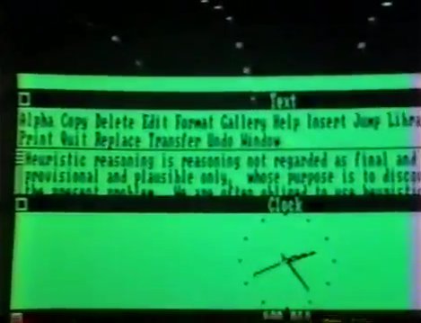
A scroll bar is in place, but it’s at the left rather than the right side of the window.

A few weeks after Comdex closed up shop, VisiCorp shipped Visi On, to cautiously positive press notices behind which lurked all of the concerns that would prove the product’s undoing: its high price; its high system requirements and slow performance even on a hot-rod machine; its lack of compatibility with vanilla MS-DOS applications; the huge hardware hurdle developers had to leap to make applications for the system. Bill Gates, in other words, needn’t worry himself overmuch on that front.

But a month after Visi On made its underwhelming debut, the Apple Macintosh made its overwhelming version of same in the form of that famous “1984” television advertisement, which aired to an audience of 96 million viewers during the third quarter of the Super Bowl. Two days later, when the new computer was introduced in a slightly more orderly way at De Anza College’s Flint Auditorium, Bill Gates was there to support his sometime friend, sometime rival Steve Jobs in the biggest moment of his busy life to date. Versions of Microsoft Multiplan and BASIC for the Macintosh, Gates could announce there, would be available from the day the new computer shipped.

The announcement of the Mac version of Microsoft BASIC at the ceremony marked one of the last gasps of the old Microsoft business model which dated back to the days of the Altair kit computer, when they would supply a BASIC as a matter of course for every new microcomputer to come down the pipe. [1]That said, it wasn’t quite the last gasp: Microsoft would also supply a BASIC for the Commodore Amiga, constituting the only piece of software they would ever develop for that machine, shortly after its release in 1985. But more important than the BASIC or even the Mac Multiplan was the mere fact that Microsoft was there at all in Flint Auditorium, getting their piece of the action. Bill Gates was doing what he always did, seeking to control those parts of the industry which he could and exploit those parts which he couldn’t. He didn’t know whether the Macintosh was destined to take over business computing entirely, as some were claiming, or whether its flaws, all too easily overlooked under the auditorium’s bright lights, would undermine its prospects in the end. Certainly those flaws were legion when you dug below the surface, including but not limited to a price which was, if vastly less than that of the Lisa, still far more than a typical MS-DOS machine; the lack of a hard drive; the straitened memory of just 128 K; the lack of amenability to expansion, which only exacerbated the previous three flaws; the lack of multitasking or even the ability to open concurrent programs; and an interface which corporate America might read as too friendly, crossing past the friend zone into cutesy and unbusinesslike. But what Bill Gates did know, with every bit as much certainty as Steve Jobs, was that the GUI in the abstract was the future of computing.

In June of 1984, with Windows having missed its release target of two months previous but still hopefully listed in Microsoft’s catalog as “coming soon,” Gates and Steve Ballmer wrote an internal memo which described in explicit, unvarnished detail their future strategy of playing the Macintosh and Windows off against one another:

Microsoft believes in the mouse and graphics as invaluable to the man-machine interface. We will bet on that belief by focusing new development on the two new environments with the mouse and graphics: Macintosh and Windows.

This also makes sense from a marketing perspective. Our focus will be on the business user, a customer who can afford the extra hardware expense of a mouse and high-resolution screen, and who will pay premium prices for quality easy-to-use software.

Microsoft will not invest significant development resources in new Apple II, MSX, CP/M-80, or character-based IBM PC applications. We will finish development and do a few enhancements to existing products.

Over the foreseeable future, our plan is to implement products first for the Mac and then to port them to Windows. We are taking care in the design of the Windows user interface to make this as easy as possible.

In his more unguarded moments, Gates would refer to Windows as “Mac on the [IBM] PC.”

Just one worrisome unknown continued to nag at him: what role would IBM play in his GUI-driven world of the future?

(Sources: the books The Making of Microsoft: How Bill Gates and His Team Created the World’s Most Successful Software Company by Daniel Ichbiah and Susan L. Knepper, Hard Drive: Bill Gates and the Making of the Microsoft Empire by James Wallace and Jim Erickson, Gates: How Microsoft’s Mogul Reinvented an Industry and Made Himself the Richest Man in America by Stephen Manes and Paul Andrews, and Apple Confidential 2.0: The Definitive History of the World’s Most Colorful Company by Owen W. Linzmayer; PC World of September 1983; InfoWorld of May 30 1983, November 21 1983, April 2 1984, October 21 1991, and November 20 1995; MacWorld of September 1991; Byte of December 1983. Finally, I owe a lot to Nathan Lineback for the histories, insights, comparisons, and images found at his wonderful online “GUI Gallery.”)

Footnotes

Footnotes
1 That said, it wasn’t quite the last gasp: Microsoft would also supply a BASIC for the Commodore Amiga, constituting the only piece of software they would ever develop for that machine, shortly after its release in 1985.
 

Tags: , , ,

Doing Windows, Part 1: MS-DOS and Its Discontents

Has any successful piece of software ever deserved its success less than the benighted, unloved exercise in minimalism that was MS-DOS? The program that started its life as a stopgap under the name of “The Quick and Dirty Operating System” at a tiny, long-forgotten hardware maker called Seattle Computer Products remained a stopgap when it was purchased by Bill Gates of Microsoft and hastily licensed to IBM for their new personal computer. Archaic even when the IBM PC shipped in October of 1981, MS-DOS immediately sent half the software industry scurrying to come up with something better. Yet actually arriving at a viable replacement would absorb a decade’s worth of disappointment and disillusion, conflict and compromise — and even then the “replacement” would still have to be built on top of the quick-and-dirty operating system that just wouldn’t die.

This, then, is the story of that decade, and of how Microsoft at the end of it finally broke Windows into the mainstream.


When IBM belatedly turned their attention to the emerging microcomputer market in 1980, it was both a case of bold new approaches and business-as-usual. In the willingness they showed to work together with outside partners on the hardware and especially the software front, the IBM PC was a departure for them. In other ways, though, it was a continuation of a longstanding design philosophy.

With the introduction of the System/360 line of mainframes back in 1964, IBM had in many ways invented the notion of a computing platform: a nexus of computer models that could share hardware peripherals and that could all run the same software. To buy an IBM system thereafter wasn’t so much to buy a single computer as it was to buy into a rich computing ecosystem. Long before the saying went around corporate America that “no one ever got fired for buying Microsoft,” the same was said of IBM. When you contacted them, they sent a salesman or two out to discuss your needs, desires, and budget. Then, they tailored an installation to suit and set it up for you. You paid a bit more for an IBM, but you knew it was safe. System/360 models were available at prices ranging from $2500 per month to $115,000 per month, with the latter machine a thousand times more powerful than the former. Their systems were thus designed, as all their sales literature emphasized, to grow with you. When you needed more computer, you just contacted the mother ship again, and another dark-suited fellow came out to help you decide what your latest needs really were. With IBM, no sharp breaks ever came in the form of new models which were incompatible with the old, requiring you to remake from scratch all of the processes on which your business depended. Progress in terms of IBM computing was a gradual evolution, not a series of major, disruptive revolutions. Many a corporate purchasing manager loved them for the warm blanket of safety, security, and compatibility they provided. “Once a customer entered the circle of 360 users,” noted IBM’s president Thomas Watson Jr., “we knew we could keep him there a very long time.”

The same philosophy could be seen all over the IBM PC. Indeed, it would, as much as the IBM name itself, make the first general-purpose IBM microcomputer the accepted standard for business computing on the desktop, just as were their mainframe lines in the big corporate data centers. You could tell right away that the IBM PC was both built to last and built to grow along with you. Opening its big metal case revealed a long row of slots just waiting to be filled, thereby transforming it into exactly the computer you needed. You could buy an IBM PC with one or two floppy drives, or more, or none; with a color or a monochrome display card; with anywhere from 16 K to 256 K of RAM.

But the machine you configured at time of purchase was only the beginning. Both IBM and a thriving aftermarket industry would come to offer heaps more possibilities in the months and years that followed the release of the first IBM PC: hard drives, optical drives, better display cards, sound cards, ever larger RAM cards. And even when you finally did bite the bullet and buy a whole new machine with a faster processor, such as 1984’s PC/AT, said machine would still be able to run the same software as the old, just as its slots would still be able to accommodate hardware peripherals scavenged from the old.

Evolution rather than revolution. It worked out so well that the computer you have on your desk or in your carry-on bag today, whether you prefer Windows, OS X, or Linux, is a direct, lineal descendant of the microcomputer IBM released more than 35 years ago. Long after IBM themselves got out of the PC game, and long after sexier competitors like the Commodore Amiga and the first and second generation Apple Macintosh have fallen by the wayside, the beast they created shambles on. Its long life is not, as zealots of those other models don’t hesitate to point out, down to any intrinsic technical brilliance. It’s rather all down to the slow, steady virtues of openness, expandibility, and continuity. The timeline of what’s become known as the “Wintel” architecture in personal computing contains not a single sharp break with the past, only incremental change that’s been carefully managed — sometimes even technologically compromised in comparison to what it might have been — so as not to break compatibility from one generation to the next.

That, anyway, is the story of the IBM PC on the hardware side, and a remarkable story it is. On the software side, however, the tale is more complicated, thanks to the failure of IBM to remember the full lesson of their own System/360.

At first glance, the story of the IBM PC on the software side seems to be just another example of IBM straining to offer a machine that can be made to suit every potential customer, from the casual home user dabbling in games and BASIC to the most rarefied corporate purchaser using it to run mission-critical applications. Thus when IBM announced the computer, four official software operating paradigms were also announced. One could use the erstwhile quick-and-dirty operating system that was now known as MS-DOS; [1]MS-DOS was known as PC-DOS when sold directly under license by IBM. Its functionality, however, was almost or entirely identical to the Microsoft-branded version. For simplicity’s sake, I will just refer to “MS-DOS” whenever speaking about either product — or, more commonly, both — in the course of this series of articles. one could use CP/M, the standard for much of pre-IBM business microcomputing, from which MS-DOS had borrowed rather, shall we say, extensively (remember the latter’s original name?); one could use an innovative cross-platform environment, developed by the University of California San Diego’s computer-science department, that was based around the programming language Pascal; or one could choose not to purchase any additional operating software at all, instead relying on the machine’s built-in ROM-hosted Microsoft BASIC environment, which wasn’t at all dissimilar from those the same company had already provided for many or most of the other microcomputers on the market.

In practice, though, this smorgasbord of possibilities only offered one remotely appetizing entree in the eyes of most users. The BASIC environment was really suited only to home users wanting to tinker with simple programs and save them on cassettes, a market IBM had imagined themselves entering with their first microcomputer but had in reality priced themselves out of. The UCSD Pascal system was ahead of its time with its focus on cross-platform interoperability, accomplished using a form of byte code that would later inspire the Java virtual machine, but it was also rather slow, resource-hungry, and, well, just kind of weird — and it was quite expensive as well. CP/M ought to have been poised for success on the new machine given its earlier dominance, but its parent company Digital Research was unconscionably late making it available for the IBM PC, taking until well after the machine’s October 1981 launch to get it ported from the Zilog Z-80 microprocessor to the Intel architecture of the IBM PC and its successor models — and when CP/M finally did appear it was, once again, expensive.

That left MS-DOS, which worked, was available, and was fairly cheap. As corporations rushed out to purchase the first safe business microcomputer at a pace even IBM had never anticipated, MS-DOS relegated the other three solutions to a footnote in computing history. Nobody’s favorite operating system, it was about to become the most popular one in the world.

The System/360 line that had made IBM the 800-pound gorilla of large-scale corporate data-processing had used an operating system developed in-house by them with an eye toward the future every bit as pronounced as that evinced by the same line’s hardware. The emerging IBM PC platform, on the other hand, had gotten only half of that equation down. MS-DOS was locked into the 1 MB address space of the Intel 8088, allowing any computer on which it ran just 640 K of RAM at the most. When newer Intel processors with larger address spaces began to appear in new IBM models as early as 1984, software and hardware makers and ordinary users alike would be forced to expend huge amounts of time and effort on ugly, inefficient hacks to get around the problem.

Infamous though the 640 K barrier would become, memory was just one of the problems that would dog MS-DOS programmers throughout the operating system’s lifetime. True to its post-quick-and-dirty moniker of the Microsoft Disk Operating System, most of its 27 function calls involved reading and writing to disks. Otherwise, it allowed programmers to read the keyboard and put text on the screen — and not much of anything else. If you wanted to show graphics or play sounds, or even just send something to the printer, the only way to do it was to manually manipulate the underlying hardware. Here the huge amount of flexibility and expandability that had been designed into the IBM PC’s hardware architecture became a programmer’s nightmare. Let’s say you wanted to put some graphics on the screen. Well, a given machine might have an MDA monochrome video card or a CGA color card, or, soon enough, a monochrome Hercules card or a color EGA card. You the programmer had to build into your program a way of figuring out which one of these your host had, and then had to write code for dealing with each possibility on its own terms.

An example of how truly ridiculous things could get is provided by WordPerfect, the most popular business word processor from the mid-1980s on. WordPerfect Corporation maintained an entire staff of programmers whose sole job function was to devour the technical specifications and command protocols of each new printer that hit the market and write drivers for it. Their output took the form of an ever-growing pile of disks that had to be stuffed into every WordPerfect box, even though only one of them would be of any use to any given buyer. Meanwhile another department had to deal with the constant calls from customers who had purchased a printer for which they couldn’t find a driver on their extant mountain of disks, situations that could be remedied in the era before widespread telecommunications only by shipping off yet more disks. It made for one hell of a way to run a software business; at times the word processor itself could almost feel like an afterthought for WordPerfect Printer Drivers, Inc.

But the most glaringly obvious drawback to MS-DOS stared you in the face every time you turned on the computer and were greeted with that blinking, cryptic “C:\>” prompt. Hackers might have loved the command line, but it was a nightmare for a secretary or an executive who saw the computer only as an appliance. MS-DOS contrived to make everything more difficult through its sheer primitive minimalism. Think of the way you work with your computer today. You’re used to having several applications open at once, used to being able to move between them and cut and paste bits and pieces from one to the other as needed. With MS-DOS, you couldn’t do any of this. You could run just one application at a time, which would completely fill the screen. To do something else, you had to shut down the application you were currently using and start another. And if what you were hoping to do was to use something you had made in the first application inside the second, you could almost always forget about it; every application had its own proprietary data formats, and MS-DOS didn’t provide any method of its own of moving data from one to another.

Of course, the drawbacks of MS-DOS spelled opportunity for those able to offer ways to get around them. Thus Lotus Corporation became one of the biggest software success stories of the 1980s by making Lotus 1-2-3, an unwieldy colossus that integrated a spreadsheet, a database manager, and a graph- and chart-maker into a single application. People loved the thing, bloated though it was, because all of its parts could at least talk to one another.

Other solutions to the countless shortcomings of MS-DOS, equally inelegant and partial, were rampant by the time Lotus 1-2-3 hit it big. Various companies published various types of hacks to let users keep multiple applications resident in memory, switching between them using special arcane key sequences. Various companies discussed pacts to make interoperable file formats for data transfer between applications, although few of them got very far. Various companies made a cottage industry out of selling pre-packaged printer drivers to other developers for use in their applications. People wrote MS-DOS startup scripts that brought up easy-to-choose-from menus of common applications on bootup, thereby insulating timid secretaries and executives alike from the terrifying vagueness of the command line. And everybody seemed to be working a different angle when it came to getting around the 640 K barrier.

All of these bespoke solutions constituted a patchwork quilt which the individual user or IT manager would have to stitch together for herself in order to arrive at anything like a comprehensive remedy for MS-DOS’s failings. But other developers had grander plans, and much of their work quickly coalesced around various forms of the graphical user interface. Initially, this fixation may sound surprising if not inexplicable. A GUI built using a mouse, menus, icons, and windows would seem to fix only one of MS-DOS’s problems, that being its legendary user-unfriendliness. What about all the rest of its issues?

As it happens, when we look closer at what a GUI-based operating environment does and how it does it, we find that it must or at least ought to carry with it solutions to MS-DOS’s other issues as well. A windowed environment ideally allows multiple applications to be open at one time, if not actually running simultaneously. Being able to copy and paste pieces from one of those open applications to another requires interoperable data formats. Running or loading multiple applications also means that one of them can’t be allowed to root around in the machine’s innards indiscriminately, lest it damage the work of the others; this, then, must mark the end of the line for bare-metal programming, shifting the onus onto the system software to provide a proper layer of high-level function calls insulating applications from a machine’s actual or potential hardware. And GUIs, given that they need to do all of the above and more, are notoriously memory-hungry, which obligated many of those who made such products in the 1980s to find some way around MS-DOS’s memory constraints. So, a GUI environment proves to be much, much more than just a cutesy way of issuing commands to the computer. Implementing one on an IBM PC or one of its descendants meant that the quick-and-dirty minimalism of MS-DOS had to be chucked forever.

Some casual histories of computing would have you believe that the entire software industry was rigidly fixated on the command line until Steve Jobs came along to show them a better way with the Apple Macintosh, whereupon they were dragged kicking and screaming into computing’s necessary future. Such histories generally do acknowledge that Jobs himself got the GUI religion after a visit to the Xerox Palo Alto Research Center in December of 1979, but what tends to get lost is the fact that he was hardly alone in viewing PARC’s user-interface innovations as the natural direction for computing to go in the more personal, friendlier era of high technology being ushered in by the microcomputer. Indeed, by 1981, two years before a GUI made its debut on an Apple product in the form of the Lisa, seemingly everyone was already talking about them, even if the acronym itself had yet to be invented. This is not meant to minimize the hugely important role Apple really would play in the evolution of the GUI; as we’ll see to a large extent in the course of this very series of articles, they did much original formative work that has made its way into the computer you’re probably using to read these words right now. It’s rather just to say that the complete picture of how the GUI made its way to the personal computer is, as tends to happen when you dig below the surface of any history, more variegated than a tidy narrative of “A caused B which caused C” allows for.

In that spirit, we can note that the project destined to create the MS-DOS world’s first GUI was begun at roughly the same time that a bored and disgruntled Steve Jobs over at Apple, having been booted off the Lisa project, seized control of something called the Macintosh, planned at the time as an inexpensive and user-friendly computer for the home. This other pioneering project in question, also started during the first quarter of 1981, was the work of a brief-lived titan of business software called VisiCorp.

VisiCorp had been founded by one Dan Fylstra under the name of Personal Software in 1978, at the very dawn of the microcomputer age, as one of the first full-service software publishers, trafficking mostly in games which were submitted to him by hobbyists. His company became known for their comparatively slick presentation in a milieu that was generally anything but; MicroChess, one of their first releases, was quite probably the first computer game ever to be packaged in a full-color box rather than a Ziploc baggie. But their course was changed dramatically the following year when a Harvard MBA student named Dan Bricklin contacted Fylstra with a proposal for a software tool that would let accountants and other businesspeople automate most of the laborious financial calculations they were accustomed to doing by hand. Fylstra was intrigued enough to lend the microcomputer-less Bricklin one of his own Apple IIs — whereupon, according to legend at least, the latter proceeded to invent the electronic spreadsheet over the course of a single weekend. He hired a more skilled programmer named Bob Frankston and formed a company called Software Arts to develop that rough prototype into a finished application, which Fylstra’s Personal Software published in October of 1979.

Up to that point, early microcomputers like the Apple II, Radio Shack TRS-80, and Commodore PET had been a hard sell as practical tools for business — even for their most seemingly obvious business application of all, that of word processing. Their screens could often only display 40 columns of big, blocky characters, often only in upper case — about as far away from the later GUI ideal of “what you see is what you get” as it was possible to go — while their user interfaces were arcane at best and their minuscule memories could only accommodate documents of a few pages in length. Most potential business users took one look at the situation, added on the steep price tag for it all, and turned back to their typewriters with a shrug.

VisiCalc, however, was different. It was so clearly, manifestly a better way to do accounting that every accountant Fylstra showed it to lit up like a child on Christmas morning, giggling with delight as she changed a number here or there and watched all of the other rows and columns update automagically. VisiCalc took off like nothing the young microcomputer industry had ever seen, landing tens of thousands of the strange little machines in corporate accounting departments. As the first tangible proof of what personal computing could mean to business, it prompted people to begin asking why IBM wasn’t a part of this new party, doing much to convince the latter to remedy that absence by making a microcomputer of their own. It’s thus no exaggeration to say that the entire industry of business-oriented personal computing was built on the proof of concept that was VisiCalc. It would sell 500,000 copies by January of 1983, an absolutely staggering figure for that time. Fylstra, seeing what was buttering his bread, eventually dropped all of the games and other hobbyist-oriented software from his catalog and reinvented Personal Software as VisiCorp, the first major publisher of personal-computer business applications.

But all was not quite as rosy as it seemed at the new VisiCorp. Almost from the moment of the name change, Dan Fylstra found his relationship with Dan Bricklin growing strained. The latter was suspicious of his publisher’s rebranding themselves in the image of his intellectual property, feeling they had been little more than the passive beneficiaries of his brilliant stroke. This point of view was by no means an entirely fair one. While it may have been true that Fylstra had been immensely lucky to get his hands on Bricklin’s once-in-a-lifetime innovation, he’d also made it possible by loaning Bricklin an Apple II in the first place, then done much to make VisiCalc palatable for corporate America through slick, professional packaging and marketing that projected exactly the right conservative, businesslike image, consciously eschewing the hippie ethos of the Homebrew Computer Club. Nevertheless, Bricklin, perhaps a bit drunk on all the praise of his genius, credited VisiCorp’s contribution to VisiCalc’s success but little. And so Fylstra, nervous about continuing to stake his entire company on Bricklin, set up an internal development team to create more products for the business market.

By the beginning of 1981, the IBM PC project which VisiCalc had done so much to prompt was in full swing, with the finished machine due to be released before the end of the year. Thanks to their status as publisher of the hottest application in business software, VisiCorp had been taken into IBM’s confidence, one of a select number of software developers and publishers given access to prototype hardware in order to have products ready to go on the day the new machine shipped. It seems that VisiCorp realized even at this early point how underwhelming the new machine’s various operating paradigms were likely to be, for even before they had actual IBM hardware to hand, they started mocking up the GUI environment that would become known as Visi On using Apple II and III machines. Already at this early date, it reflected a real, honest, fundamental attempt to craft a more workable model for personal computing than the nightmare that MS-DOS alone could be. William Coleman, the head of the development team, later stated in reference to the project’s founding goals that “we wanted users to be able to have multiple programs on the screen at one time, ease of learning and use, and simple transfer of data from one program to another.”

Visi On seemed to have huge potential. When VisiCorp demonstrated an early version, albeit far later than they had expected to be able to, at a trade show in December of 1982, Dan Fylstra remembers a rapturous reception, “competitors standing in front of [the] booth at the show, shaking their heads and wondering how the company had pulled the product off.” It was indeed an impressive coup; well before the Apple Macintosh or even Lisa had debuted, VisiCorp was showing off a full-fledged GUI environment running on hardware that had heretofore been considered suitable only for ugly old MS-DOS.

Still, actually bringing a GUI environment to market and making a success out of it was a much taller order than it might have first appeared. As even Apple would soon be learning to their chagrin, any such product trying to make a go of it within the increasingly MS-DOS-dominated culture of mainstream business computing ran headlong into a whole pile of problems which lacked clearly best solutions. Visi On, like almost all of the GUI products that would follow for the IBM hardware architecture, was built on top of MS-DOS, using the latter’s low-level function calls to manage disks and files. This meant that users could install it on their hard drive and pop between Visi On and vanilla MS-DOS as the need arose. But a much thornier question was that of running existing MS-DOS applications within the Visi On environment. Those which assumed they had full control of the system — which was practically all of them, because why wouldn’t they? — would flame out as soon as they tried to directly access some piece of hardware that was now controlled by Visi On, or tried to put something in some specific place inside what was now a shared pool of memory, or tried to do any number of other now-forbidden things. VisiCorp thus made the hard decision to not even try to get existing MS-DOS applications to run under Visi On. Software developers would have to make new, native applications for the system; Visi On would effectively be a new computing platform onto itself.

This decision was questionable in commercial if not technical terms, given how hard it must be to get a new platform accepted in an MS-DOS-dominated marketplace. But VisiCorp then proceeded to make the problem even worse. It would only be possible to program Visi On, they announced, after purchasing an expensive development kit and installing it on a $20,000 DEC PDP-11 minicomputer. They thus opted for an approach similar to one Apple was opting for with the Lisa: to allow that machine to be programmed only by yoking it up to a second Lisa. In thus betraying the original promise of the personal computer as an anything machine which ordinary users could program to do their will, both Visi On and the Lisa operating system arguably removed their hosting hardware from that category entirely, converting it into a closed electronic appliance more akin to a game console. Taxonomical debates aside, the barriers to entry even for one who wished merely to use Visi On to run store-bought applications were almost as steep: when this first MS-DOS-based GUI finally shipped on December 16, 1983, after a long series of postponements, it required a machine with 512 K of memory and a hard drive to run and cost more than $1000 to buy.

Visi On was, as the technology pundits like to say, “ahead of the hardware market.” In quite a number of ways it was actually far more ambitious than what would emerge a month or so after it as the Apple Macintosh. Multiple Visi On applications could be open at the same time (although they didn’t actually run concurrently), and a surprisingly sophisticated virtual-memory system was capable of swapping out pages to hard disk if software tried to allocate more memory than was physically available on the computer. Similar features wouldn’t reach MacOS until 1987’s System 5 and 1991’s System 7 respectively.

In the realm of usability, however, Visi On unquestionably fell down in comparison to Apple’s work. The user interfaces for the Lisa and the Macintosh made almost all the right choices right from the beginning, expanding upon the work done at Xerox PARC in all the right ways. Many of the choices made by VisiCorp, on the other hand, feel far more dubious today — and, one has to believe, not just out of the contempt bred by all those intervening decades of user interfaces modeled on Apple’s. Consider the task of moving and sizing windows on the screen, which was implemented so elegantly on the original Lisa and Macintosh that it’s been changed not at all in all the decades since. While Visi On too allows windows to be sized and placed where you will, and allows them to overlay one another — something by no means true of all of the MS-DOS GUI systems that would follow — doing so is a clumsy process involving picking options out of menus rather than simply dragging title bars or sizing widgets. In fact, Visi On uses no icons whatsoever. For anyone still enamored with the old saw that Apple just ripped off the Xerox PARC interface in its entirety and stuck it on the Lisa and Mac, Visi On, being much more slavishly based on the PARC model, provides an instructive demonstration of how far the likes of the Xerox Alto still was from the intuitive ease of Apple’s interface.

A Quick Tour of Visi On


With mice still exotic creatures, VisiCorp provided their own to work with Visi On. Many other early GUI-makers, Microsoft among them, would follow their lead.

Visi On looks like this upon booting up on an original IBM PC with 640 K of memory and a CGA video card, running in high-resolution monochrome mode at 640 X 200. “Services” is Visi On’s terminology for installed applications. The list of them which you see here, all provided by VisiCorp themselves, are the only ones that would ever exist, thanks to Visi On’s complete commercial failure.

We’ve started up a spreadsheet, a graphing application, and a word processor at the same time. These don’t actually run concurrently, as they would under a true multitasking operating system, but are visible onscreen in their separate windows, becoming active when we click them. (Something similar would not have been possible under MacOS prior to 1987.)

Although Visi On does sport windows that can be sized and placed anywhere and can overlap one another, arranging them is made extremely tedious by its lack of any concept of mouse-dragging; the mouse can only be used for single clicks. So, you have to click the “Frame” menu option and see its instructions through step by step. Note also the lack of pull-down menus, another of Apple’s expansions upon the work down at Xerox PARC. Menus here are just one-shot commands, akin to what a modern GUI user would call a button.

Fortunately, you can make a window full-screen with just a couple of clicks. Unfortunately, you then have to laboriously re-“Frame” it when you want to shrink it again; it doesn’t remember where it used to be.

The lack of a mouse-drag affordance makes the “Transfer” function — Visi On’s version of copy-and-paste — extremely tedious.

And, as with most things in Visi On, transferring data is also slow. Moving that little snippet of text from the word processor to the spreadsheet took about ten seconds.

On the plus side, Visi On sports a help system that’s crazily comprehensive for its time — much more so than the one that would ship with MacOS or, for that matter, Microsoft Windows for quite some years.

As if it didn’t have enough intrinsic problems working against it, extrinsic ones also contrived to undo Visi On in the marketplace. By the time it shipped, VisiCorp was a shadow of what they had so recently been. VisiCalc sales had collapsed over the past year, going from nearly 40,000 units in December of 1982 alone to fewer than 6000 units in December of 1983 in the face of competing products — most notably the burgeoning juggernaut Lotus 1-2-3 — and what VisiCorp described as Software Arts’s failure to provide “timely upgrades” amidst a relationship that was growing steadily more tense. With VisiCorp’s marketplace clout thus dissipating like air out of a balloon, it was hardly the ideal moment for them to ask for the sorts of commitments from users and developers required by Visi On.

The very first MS-DOS-based GUI struggled along with no uptake whatsoever for nine months or so; the only applications made for it were the word processor, spreadsheet, and graphing program VisiCorp made themselves. In September of 1984, with VisiCorp and Software Arts now embroiled in a court battle that would benefit only their competitors, the Visi On technology was sold to a veteran manufacturer of mainframes and supercomputers called Control Data Corporation, who proceeded to do very little if anything with it. VisiCorp went bankrupt soon after, while Lotus bought out Software Arts for a paltry $800,000, thus ending the most dramatic boom-and-bust tale of the early business-software industry. “VisiCorp’s auspicious climb and subsequent backslide,” wrote InfoWorld magazine, “will no doubt become a ‘how-not-to’ primer for software companies of the future.”

Visi On’s struggles may have been exacerbated by the sorry state of its parent company, but time would prove them to be by no means atypical of MS-DOS-based GUI systems in general.  Already in February of 1984, PC Magazine could point to at least four other GUIs of one sort or another in the works from other third-party developers: Concurrent CP/M with Windows by Digital Research, VisuALL by Trillian Computer Corporation, DesqView by Quarterdeck Office Systems, and WindowMaster by Structured Systems. All of these would make different choices in trying to balance the seemingly hopelessly competing priorities of reasonable speed and reasonable hardware requirements, compatibility with MS-DOS applications and compatibility with post-MS-DOS philosophies of computing. None would find the sweet spot. Neither they nor the still more GUI environments that followed them would be able to offer a combination of features, ease of use, and price that the market found compelling, so much so that by 1985 the whole field of MS-DOS GUIs was coming to be viewed with disdain by computer users who had been disappointed again and again. If you wanted a GUI, went the conventional wisdom, buy a Macintosh and live with the paltry software selection and the higher price. The mainstream of business computing, meanwhile, continued to truck along with creaky old MS-DOS, a shaky edifice made still more unstable by all of the hacks being grafted onto it to expand its memory model or to force it to load more than one application at a time. “Windowing and desktop environments are a solution looking for a problem,” said Robert Lefkowits, director of software services for Infocorp, in the fall of 1985. “Users aren’t really looking for any kind of windowing environment to solve problems. Users are not expressing a need or desire for it.”

The reason they weren’t, of course, was because they hadn’t yet seen a GUI in which the pleasure outweighed the pain. Entrenched as users were in the old way of doing things, accepting as they had become of all of MS-DOS’s discontents as simply the way computing was, it was up to software developers to show them why a GUI was something they had never known they couldn’t live without. Microsoft at least, the very people who had saddled their industry with the MS-DOS albatross, were smart enough to realize that mainstream business computing must be remade in the image of the much-scoffed-at Macintosh at some point. Further, they understood that it behooved them to do the remaking if they didn’t want to go the way of VisiCorp. By the time Lefkowits said his words, the long, winding tale of dogged perseverance in the face of failure and frustration that would become the story of Microsoft Windows had already been playing out for several years. One of these days, the GUI was going to make its breakthrough in one way or another, and it was going to do so with a Microsoft logo on its box — even if Bill Gates had to personally ram it down his customers’ throats.

(Sources: the books The Making of Microsoft: How Bill Gates and His Team Created the World’s Most Successful Software Company by Daniel Ichbiah and Susan L. Knepper and Computer Wars: The Fall of IBM and the Future of Global Technology by Charles H. Ferguson and Charles R. Morris; InfoWorld of October 31 1983, November 14 1983, April 2 1984, July 2 1984, and October 7 1985; Byte of June 1983, July 1983; PC Magazine of February 7 1984, and October 2 1984; the episode of the Computer Chronicles television program called “Integrated Software.” Finally, I owe a lot to Nathan Lineback for the histories, insights, comparisons, and images found at his wonderful online “GUI Gallery.”)

Footnotes

Footnotes
1 MS-DOS was known as PC-DOS when sold directly under license by IBM. Its functionality, however, was almost or entirely identical to the Microsoft-branded version. For simplicity’s sake, I will just refer to “MS-DOS” whenever speaking about either product — or, more commonly, both — in the course of this series of articles.
 

Tags: , , ,

Another World

The French creative aesthetic has always been a bit different from that of English-speaking nations. In their paintings, films, even furniture, the French often discard the stodgy literalism that is so characteristic of Anglo art in favor of something more attenuated, where impression becomes more important than objective reality. A French art film doesn’t come off as a complete non sequitur to Anglo eyes in the way that, say, a Bollywood or Egyptian production can. Yet the effect it creates is in its way much more disorienting: it seems on the surface to be something recognizable and predictable, but suddenly zigs where we expect it to zag. In particular, it may show disconcertingly little interest in the logic of plot, that central concern of Anglo film. What affects what and why is of far less interest to a filmmaker like, say, François Truffaut than the emotional affect of the whole.

Crude though such stereotypes may be, when the French discovered computer games they did nothing to disprove them. For a long time, saying a game was French was a shorthand way for an Anglo to say that it was, well, kind of weird, off-kilter in a way that made it hard to judge whether the game or the player was at fault. Vintage French games weren’t always the most polished or balanced of designs, yet they must still be lauded today for their willingness to paint in emotional colors more variegated than the trite primary ones of fight or flight, laugh or cry. Such was certainly the case with Éric Chahi’s Another World.


France blazed its own trail through the earliest years of the digital revolution. Most people there caught their first glimpse of the digital future not through a home computer but through a remarkable online service called Minitel, a network of dumb terminals that was operated by the French postal and telephone service. Millions of people installed one of the free terminals in their home, making Minitel the most widely used online service in the world during the 1980s, dwarfing even the likes of CompuServe in the United States. Those in France who craved the capabilities of a full-fledged computer, meanwhile, largely rejected the Sinclair Spectrums and Commodore 64s that were sweeping the rest of Europe in favor of less universal lines like the Amstrad CPC and the Oric-1. Apple as well, all but unheard of across most of Europe, established an early beachhead in France, thanks to the efforts of a hard-charging and very Gallic general manager named Jean-Louis Gassée, who would later play a major role in shepherding the Macintosh to popularity in the United States.

In the second half of the 1980s, French hardware did begin to converge, albeit slowly, with that in use in the rest of Europe. The Commodore Amiga and Atari ST, the leading gaming computers in Europe as a whole, were embraced to at least some extent in France as well. By 1992, 250,000 Amigas were in French homes. This figure might not have compared very well to the 2.5 million of them in Britain and Germany by that point, but it was more than enough to fuel a thriving little Amiga game-development community that was already several years old. “Our games didn’t have the excellent gameplay of original English-language games,” remembers French game designer Philippe Ulrich, “but their aesthetics were superior, which spawned the term ‘The French Touch’ — later reused by musicians such as Daft Punk and Air.”

Many Amiga and ST owners had been introduced to the indelibly French perspective on games as early as 1988. That was the year of Captain Blood, which cast the player in the role of a clone doomed to die unless he could pool his vital essences with those of five other clones scattered across the galaxy — an existential quest for identity to replace the conquer-the-galaxy themes of most science-fiction games. If that alone wasn’t weird enough, the gameplay consisted mostly of talking to aliens using a strange constructed language of hieroglyphs devised by the game’s developers.

Such avoidance of in-game text, whether done as a practical method of easing the problems of localization or just out of the long-established French ambivalence toward translation from their mother tongue, would become a hallmark of the games that followed, as would a willingness to tackle subject matter that no one else would touch. The French didn’t so much reject traditional videogame themes and genres as filter them through their own sensibilities. Often, this meant reflecting American culture back upon itself in ways that could be both unsettling and illuminating. North & South, for instance, turned the Civil War, that greatest tragedy of American history, into a manic slapstick satire. For any American kid raised on a diet of exceptionalism and solemn patriotism, this was deeply, deeply strange stuff.

The creator of Another World, perhaps the ultimate example of the French Touch in games, was, as all of us must be, a product of his environment. Éric Chahi had turned ten the year that Star Wars dropped, marking the emergence of a transnational culture of blockbuster media, and he was no more immune to its charms than were other little boys all over the world. Yet he viewed that very American film through a very French lens. He liked the rhythm and the look of the thing — the way the camera panned across an endless vista of peaceful space down into a scene of battle at the beginning; the riff on Triumph of the Will that is the medal ceremony at the end — much more than he cared about the plot. His most famous work would evince this same rather non-Anglo sense of aesthetic priorities, playing with the trappings of American sci-fi pop culture but skewing them in a distinctly French way.

But first, there would be other games. From the moment Chahi discovered computers several years after Star Wars, he was smitten. “During school holidays, I didn’t see much of the sun,” he says. “Programming quickly became an obsession, and I spent around seventeen hours a day in front of a computer screen.” The nascent French games industry may have been rather insular, but that just made it if anything even more wide-open for a young man like himself than were those of other countries. Chahi was soon seeing the games he wrote — from platformers to text adventures — published on France’s oddball collection of viable 8-bit platforms. His trump card as a developer was a second talent that set him apart from the other hotshot bedroom coders: he was also a superb artist, whether working in pixels or in more traditional materials. Although none of his quickie 8-bit games became big hits, his industry connections did bring him to the attention of a new company called Delphine Software in 1988.

Delphine Software was about as stereotypically French a development house as can be imagined. It was a spinoff of Delphine Records, whose cash cow was the bizarrely popular easy-listening pianist Richard Clayderman, a sort of modern-day European Liberace who would come to sell 150 million records by 2006. Paul de Senneville, the owner of Delphine Records, was himself a composer and musician. Artist that he was, he gave his new software arm virtually complete freedom to make whatever games they felt like making. Their Paris offices looked like a hip recording studio; Chahi remembers “red carpet at the entrance, gold discs everywhere, and many eccentric contemporary art pieces.”

Future Wars

He had been hired by Delphine on the basis of his artistic rather than his programming talent, to illustrate a point-and-click adventure game with the grandiose title of Les Voyageurs du Temps: La Menace (“The Time Travelers: The Menace”), later to be released in English under the punchier name of Future Wars. Inspired by the Sierra graphic adventures of the time, it was nevertheless all French: absolutely beautiful to look at — Chahi’s illustrations were nothing short of mouth-watering — but more problematic to play, with a weird interface, weirder plot, and puzzles that were weirdest of all. As such, it stands today as a template for another decade and change of similarly baffling French graphic adventures to come, from companies like Coktel Vision as well as Delphine themselves.

But the important thing from Chahi’s perspective was that the game became a hit all across Europe upon its release in mid-1989, entirely on the basis of his stunning work as its illustrator. He had finally broken through. Yet anyone who expected him to capitalize on that breakthrough in the usual way, by settling into a nice, steady career as Delphine’s illustrator in residence, didn’t understand his artist’s temperament. He decided he wanted to make a big, ambitious game of his own all by himself — a true auteur’s statement. “I felt that I had something very personal to communicate,” he says, “and in order to bring my vision to others I had to develop the title on my own.” Like Marcel Proust holed up in his famous cork-lined Paris apartment, scribbling frantically away on In Search of Lost Time, Chahi would spend the next two years in his parents’ basement, working sixteen, seventeen, eighteen hours per day on Another World. He began with just two fixed ideas: he wanted to make a “cinematic” science-fiction game, and he wanted to do it using polygonal graphics.

Articles like this one throw around terms like “polygonal graphics” an awful lot, and their meanings may not always be clear to everyday readers. So, let’s begin by asking what separated the type of graphics Chahi now proposed to make from those he had been making before.

The pictures that Chahi had created for Future Wars were what is often referred to as pixel graphics. To make them, the artist loads a paint program, such as the Amiga’s beloved Deluxe Paint, and manipulates the actual onscreen pixels to create a background scene. Animation is accomplished using sprites: additional, smaller pictures that are overlaid onto the background scene and moved around as needed. On many computers of the 1980s, including the Amiga on which Chahi was working, sprites were implemented in hardware for efficiency’s sake. On other computers, such as the IBM PC and the Atari ST, they had to be conjured up, rather less efficiently, in software. Either way, though, the basic concept is the same.

The artist who works with polygonal graphics, on the other hand, doesn’t directly manipulate onscreen pixels. Instead she defines her “pictures” mathematically. She builds scenes out of geometric polygons of three sides or more, defined as three or more connected points, or sets of X, Y, and Z coordinates in abstract space. At run time, the computer renders all this data into an image on the monitor screen, mapping it onto physical pixels from the perspective of a “camera” that’s anchored at some point in space and pointed in a defined direction. Give a system like this one enough polygons to render, and it can create scenes of amazing complexity.

Still, it does seem like a roundabout way of approaching things, doesn’t it? Why, you may be wondering, would anyone choose to use polygonal graphics instead of just painting scenes with a conventional paint program? Well, the potential benefits are actually enormous. Polygonal graphics are a far more flexible, dynamic form of computer graphics. Whereas in the case of a pixel-art background you’re stuck with the perspective and distance the artist chose to illustrate, you can view a polygonal scene in all sorts of different ways simply by telling the computer where in space the “camera” is hanging. A polygonal scene, in other words, is more like a virtual space than a conventional illustration — a space you can move through, and that can in turn move around you, just by changing a few numbers. And it has the additional advantage that, being defined only as a collection of anchoring points for the polygons that make it up rather than needing to explicitly describe the color of every single pixel, it usually takes up much less disk space as well.

With that knowledge to hand, you might be tempted to reverse the question of the previous paragraph, and ask why anyone wouldn’t want to use polygonal graphics. In fact, polygonal graphics of one form or another had been in use on computers since the 1960s, and were hardly unheard of in the games industry of the 1980s. They were most commonly found in vehicular simulators like subLOGIC’s Flight Simulator, which needed to provide a constantly changing out-the-cockpit view of their worlds. More famously in Europe, Elite, one of the biggest games of the decade, also built its intense space battles out of polygons.

The fact is, though, that polygonal graphics have some significant disadvantages to go along with their advantages, and these were magnified by the limited hardware of the era. Rendering a scene out of polygons was mathematically intensive in comparison to the pixel-graphic-backgrounds-and-sprites approach, pushing an 8-bit or even 16-bit CPU (like the Motorola 68000 in the Amiga) hard. It was for this reason that early versions of Flight Simulator and Elite and many other polygonal games rendered their worlds only as wire-frame graphics; there just wasn’t enough horsepower to draw in solid surfaces and still maintain a decent frame rate.

And there were other drawbacks. The individual polygons from which scenes were formed were all flat surfaces; there was no concept of smooth curvature in the mathematics that underlay them. [1]More modern polygonal-graphics implementations do make use of something called splines to allow for curvature, but these weren’t practical to implement using 1980s and early 1990s computers. But the natural world, of course, is made up of almost nothing but curves. The only way to compensate for this disparity was to use many small polygons, packed so closely together that their flat surfaces took on the appearance of curvature to the eye. Yet increasing the polygon count in this way increased the burden of rendering it all on the poor overtaxed CPUs of the day — a burden that quickly became untenable. In practice, then, polygonal graphics took on a distinctive angular, artificial appearance, whose sense of artificiality was only enhanced by the uniform blotches of color in which they were drawn. [2]Again, the state of the art in modern polygonal graphics is much different today in this area than it was in Another World‘s time. Today textures are mapped on polygonal surfaces to create a more realistic appearance, and scenes are illuminated by light sources that produce realistic shadings and shadows across the whole. But all of this was hopelessly far beyond what Chahi or anyone else of Another World’s era could hope to implement in a game which needed to be interactive and to run at a reasonable speed.

These illustrations show how an object can be made to appear rounded by making it out of a sufficient number of flat polygons. The problem is that each additional polygon which must be rendered taxes the processor that much more.

For all these reasons, polygonal graphics were mostly confined to the sort of first-person-perspective games, like those aforementioned vehicular simulators and some British action-adventures, which couldn’t avoid using them. But Chahi would buck the trend by using them for his own third-person-perspective game. Their unique affordances and limitations would stamp Another World just as much as its creator’s own personality, giving the game’s environments the haunting, angular vagueness of a dream landscape. The effect is further enhanced by Chahi’s use of a muted, almost pastel palette of just 16 colors and an evocative, minimalist score by Jean-François Freitas — the only part of the game that wasn’t created by Chahi himself. Although you’re constantly threatened with death — and, indeed, will die over and over in the course of puzzling your way through the game — it all operates on the level of impression rather than reality.

According to some theories of visual art, the line between merely duplicating reality and conveying impressions of reality is the one that separates the draftsman from the artist. If so, Another World‘s visuals betray an aesthetic sophistication rarely seen in computer games of its era. While other games strained to portray violence with ever more realism, Another World went another way entirely, creating an affect that’s difficult to put into words — a quality which is itself another telltale sign of Art. Chahi:

Polygon techniques are great for animation, but the price you pay is the lack of detail. Because I couldn’t include much detail, I decided to work with the player’s imagination, creating suggestive content instead of being highly descriptive. That’s why, for example, the beast in the first scene is impressive even if it is only a big black shape. The visual style of Another World is really descended from the black-and-white comic-book style, where shape and volume are suggested in a very subtle way. By doing Another World, I learned a lot about suggestion. I learned that the medium is the player’s own imagination.

To make his suggestive rather than realistic graphics, Chahi spent much time first making tools, beginning with an editor written in a variant of BASIC. The editor’s output was then rendered in the game in assembly language for the sake of speed, with the logic of it all controlled using a custom script language of Chahi’s own devising. This approach would prove a godsend when it came time to port the game to platforms other than the Amiga; a would-be porter merely had to recreate the rendering engine on a new platform, making it capable of interpreting Chahi’s original polygonal-graphics data and scripts. Thus Another World was, in addition to being a game, actually a new cross-platform game engine as well, albeit one that would only be used for a single title.

Some of the graphics had their point of origin in the real world, having been captured using a long-established animation technique known as rotoscoping: tracing the outlines, frame by frame, of real people or objects filmed in motion, to form the basis of their animated equivalents. Regular readers of this blog may recall that Jordan Mechner used the same technique as far back as 1983 to create the characters in his cinematic karate game Karateka. Yet the differences between the two young developers’ approaches to the technique says much about the march of technology between 1983 and 1989.

Mechner shot his source footage on real film, then used a mechanical Moviola editing machine, a staple of conventional filmmakers for decades, to isolate and make prints of every third frame of the footage. He then traced these prints into his Apple II using an early drawing pad called a VersaWriter.

Chahi’s Amiga allowed a different approach. It had been developed during the brief heyday of laser-disc games in arcades. These often worked by overlaying interactive computer-generated graphics onto static video footage unspooling from the laser disc itself. Wishing to give their new computer the potential to play similar games in the home with the addition of an optional laser-disc player, the designers of the Amiga built into the machine’s graphics chips a way of overlaying the display onto other video; one color of the onscreen palette could be defined as transparent, allowing whatever video lay “below” it to peek through. The imagined laser-disc accessory would never appear due to issues of cost and practicality, but, in a classic example of an unanticipated technological side-effect, this capability combined with the Amiga’s excellent graphics in general made it a wonderful video-production workstation, able to blend digital titles and all sorts of special effects with the analog video sources that still dominated during the era. Indeed, the emerging field of “desktop video” became by far the Amiga’s most sustained and successful niche outside of games.

The same capability now simplified the process of rotoscoping dramatically for Chahi in comparison to what Mechner had been forced to do. He shot video footage of himself on an ordinary camcorder, then played it back on a VCR with single-frame stop capability. To the same television as the VCR was attached his Amiga. Chahi could thus trace the images directly from video into his Amiga, without having to fuss with prints at all.

It wasn’t until months into the development of Another World that a real game, and with it a story of sorts, began to emerge from this primordial soup of graphics technology. Chahi made a lengthy cut scene, rendered, like all of the ones that would follow, using the same graphics engine as the game’s interactive portions for the sake of aesthetic consistency. The entire scene, lasting some two and a half minutes, used just 70 K of disk space thanks to the magic of polygonal graphics. In it, the player’s avatar, a physicist named Lester Cheykin, shows up at his laboratory for a night of research, only to be sucked into his own experiment and literally plunged into another world; he emerges underwater, just a few meters above some vicious plant life eager to make a meal out of him. The player’s first task, then, is to hastily swim to the surface, and the game proper gets underway. The story that follows, such as it is, is one of more desperate escapes from the flora and fauna of this new world, including an intelligent race that don’t like Lester any more than their less intelligent counterparts. Importantly, neither the player nor Lester ever learns precisely where he is — another planet? another dimension? — or why the people that live there — we’ll just call them the “aliens” from now on for simplicity’s sake — want to kill him.

True to the spirit of the kid who found the look of Star Wars more interesting than the plot, the game is constructed with a filmmaker’s eye toward aesthetic composition rather than conventional narrative. After the opening cut scene, the whole game contains not one word devoted to dialog, exposition, or anything else until “The End” appears, excepting only grunts and muffled exclamations made in an alien language you can’t understand. All of Chahi’s efforts were poured into the visual set-pieces, which are consistently striking and surprising, often with multiple layers of action.

Chahi:

I wanted to create a truly immersive game in a very consistent, living universe with a movie feel. I never wanted to create an interactive movie itself. Instead I wanted to extract the essence of a movie — the rhythm and the drama — and place it into game form. To do this I decided to leave the screen free of the usual information aids like an energy bar, score counter, and other icons. Everything had to be in the universe, with no interruptions getting in the way.

Midway through the game, you encounter a friend, an alien who’s been imprisoned — for reasons that, needless to say, are never explained — by the same group who are out to get you. The two of you join forces, helping one another through the rest of the story. Your bond of friendship is masterfully conveyed without using words, relying on the same impressionistic visuals as everything else. The final scene, where the fellow Chahi came to call “Buddy” gently lifts an exhausted Lester onto the back of a strange winged creature and they fly away together, is one of the more transcendent in videogame history, a beautiful closing grace note that leaves you with a lump in your throat. Note the agonizingly slow pace of the snippet below, contrasted with the frenetic pace of the one above. When Chahi speaks about trying to capture the rhythm of a great movie, this is what he means.

For its creator, the ending had another special resonance. When implementing the final scene, two years after retiring into his parents’ basement, Chahi himself felt much like poor exhausted Lester, crawling toward the finish line.

But, you might ask, what has the player spent all of the time between the ominous opening cut scene and the transcendent final one actually doing? In some ways, that’s the least interesting aspect of Another World. The game is at bottom a platforming action-adventure, with a heavy emphasis on the action. Each scene is a challenge to be tackled in two phases: first, you have to figure out what Chahi wants you to do in order to get through its monsters, tricks, and traps; then, you have to execute it all with split-second precision. It’s not particularly easy. The idealized perfect player can make a perfect run through Another World, including watching all of the cut scenes, in half an hour. Imperfect real-world players, on the other hand, can expect to watch Lester die over and over as they slowly blunder their way through the game. At least you’re usually allowed to pick up pretty close to where you left off when Lester dies — because, trust me, he will die, and often.

When we begin to talk of influences and points of comparison for Another World inside the realm of games, one name inevitably leaps to mind first. I already mentioned Jordan Mechner in the context of his own work with rotoscoping, but that’s only the tip of an iceberg of similarities between Another World and his two famous games, Karateka and Prince of Persia. He was another young man with a cinematic eye, more interested in translating the “rhythm and drama” of film to an interactive medium than he was in making “interactive movies” in the sense that his industry at large tended to understand that term. Indeed, Chahi has named Karateka as perhaps the most important ludic influence on Another World, and if anything the parallels between the latter and Prince of Persia are even stronger: both were the virtually single-handed creations of their young auteurs; both largely eschew text in favor of visual storytelling; both clear their screen of score markers and other status indicators in the name of focusing on what’s really important; both are brutally difficult platformers; both can be, because of that brutal difficulty, almost more fun to watch someone else play than they are to play yourself, at least for those of us who aren’t connoisseurs of their try-and-try-again approach to game design.

Still, for all the similarities, nobody is ever likely to mistake Prince of Persia for Another World. Much of the difference must come down to — to engage in yet more crude national stereotyping — the fact that one game is indisputably American, the other very, very French. Mechner, who has vacillated between a career as a game-maker and a filmmaker throughout his life, wrote his movie scripts in the accessible, family-friendly tradition of Steven Spielberg, his favorite director, and brought the same sensibility to his games. But Chahi’s Another World has, as we’ve seen, the sensibility of an art film more so than a blockbuster. The two works together stand as a stark testimony to the way that things which are so superficially similar in art can actually be so dramatically different.

A mentally and physically drained Éric Chahi crawled the final few feet into Delphine’s offices to deliver the finished Another World in late 1991. His final task was to paint the cover art for the box, a last step in the cementing of the game as a deeply personal expression in what was already becoming known as a rather impersonal medium. It was released in Europe before the end of the year, whereupon it became a major, immediate hit for reasons that, truth be told, probably had little to do with its more emotionally resonant qualities: in a market that thrived on novelty, it looked like absolutely nothing else. That alone was enough to drive sales, but in time at least some of the young videogame freaks who purchased it found in it something they’d never bargained for: the ineffable magic of a close encounter with real Art. Memories of those feelings continue to make it a perennial today whenever people of a certain age draw up lists of their favorite games.

Delphine had an established relationship with Interplay as their American publisher. The latter were certainly intrigued by Chahi’s creation, but seemed a little nonplussed by its odd texture. They thus lobbied him for permission to replace its evocative silences, which were only occasionally broken up by Jean-François Freitas’s haunting score, with a more conventional thumping videogame soundtrack. Chahi was decidedly opposed, to the extent of sending Interplay’s offices an “infinite fax” repeating the same sentence again and again: “Keep the original music!” Thankfully, they finally agreed to do so, although conflicts with a long-running daytime soap opera which was also known as Another World did force them to change the name of the game in the United States to the more gung-ho-sounding Out of This World. But on the positive side, they put the game through the rigorous testing process the air-fairy artistes at Delphine couldn’t be bothered with, forcing Chahi to fix hundreds of major and minor bugs and unquestionably turning it into a far tighter, more polished experience.

I remember Out of this World‘s 1992 arrival in the United States with unusual vividness. I was still an Amiga loyalist at the time, even as the platform’s star was all too obviously fading in my country. It will always remain imprinted on my memory as the last “showpiece” Amiga game I encountered, the last time I wanted to call others into the room and tell them to “look at this!” — the last of a long line of such showpieces that had begun with Defender of the Crown back in 1986. For me, then, it marked the end of an era in my life. Shortly thereafter, my once-beloved old Amiga got unceremoniously dumped into the closet, and I didn’t have much to do with computers at all for the next two or three years.

But Interplay, of course, wasn’t thinking of endings when the Amiga version of Out of this World was greeted with warm reviews in the few American magazines still covering Amiga games. Computer Gaming World called the now-iconic introductory cut scene “one of the most imaginative pieces of non-interactive storytelling ever associated with a computer game” — a description which might almost, come to think of it, be applied to the game as a whole, depending on how broad your definition of “interactive storytelling” is willing to be. Reviewers did note that the game was awfully short, however, prompting Interplay to cajole the exhausted Chahi into making one more scene for the much-anticipated MS-DOS port. This he duly did, diluting the concentrated experience that was the original version only moderately in the process.

The game was ported to many more platforms in the years that followed, including to consoles like the Super Nintendo and Sega Genesis, eventually even to iOS and Android in the form of a “20th Anniversary Edition.” Chahi estimates that it sold some 1 million copies in all during the 1990s alone. He made the mistake of authorizing Interplay to make a sequel called Heart of the Alien for the Sega CD game console in 1994, albeit with the typically artsy stipulation that it must be told from the point of view of Buddy. The results were so underwhelming that he regrets the decision to this day, and has resisted all further calls to make or authorize sequels. Instead he’s worked on other games over the years, but only intermittently, mixing his work in games with a range of other pursuits such as volcanology, photography, and painting. His ludography remains tiny — another trait, come to think of it, that he shares with Jordan Mechner — and he is still best known by far for Another World, which is perhaps just as well; it’s still his own personal favorite of his games. It remains today a touchstone for a certain school of indie game developers in particular, who continue to find inspiration in its artsy, affective simplicity.

In fact, Another World raises some interesting questions about the very nature of games. Is it possible for a game that’s actually not all that great at all in terms of mechanics and interactivity to nevertheless be a proverbial great game in some more holistic sense? The brilliant strategy-game designer Sid Meier has famously called a good game “a series of interesting decisions.” Another World resoundingly fails to meet this standard of ludic goodness. In it, you the player have virtually no real decisions to make at all; your task is rather to figure out the decisions which Éric Chahi has already made for Lester, and thereby to advance him to the next scene. Of course, the Sid Meier definition of gaming goodness can be used to criticize plenty of other games — even other entire game genres. Certainly most adventure games as well are largely exercises in figuring out the puzzle solutions the author has already set in place. Yet even they generally offer a modicum of flexibility, a certain scope for exploration in, if nothing else, the order in which you approach the puzzles. Another World, on the other hand, allows little more scope for exploration or improvisation than the famously straitjacketed Dragon’s Lair — which is, as it happens, another game Chahi has listed as an inspiration. Winning Dragon’s Lair entails nothing more nor less than making just the right pre-determined motions with the controller at just the right points in the course of watching a static video clip. In Another World, Lester is at least visibly responsive to your commands, but, again, anything but the exactly right commands, executed with perfect precision, just gets him killed and sends you back to the last checkpoint to try again.

So, for all that it’s lovely and moving to look at, does Another World really have any right to be a game at all? Might it not work better as an animated short? Or, to frame the question more positively, what is it about the interactivity of Another World that actually adds to the audiovisual experience? Éric Chahi, for his part, makes a case for his game using a very different criterion from that of Meier’s “interesting decisions”:

It’s true that Another World is difficult. When I played it a year ago, I discovered how frustrating it can be sometimes — and breathtaking at the same time. The trial-and-error doesn’t disturb me, though. Another World is a game of survival on a hostile world, and it really is about life and death. Death doesn’t mean the end of the game, but it is a part of the exploration, a part of the experience. That’s why the death sequences are so diversified. To solve many puzzles, I recognize that you have to die at least once, and this certainly isn’t the philosophy of today’s game design. It is a controversial point in Another World’s design because it truly serves the emotional side of things and the player’s attachment to the characters, but it sometimes has a detrimental effect on the gameplay. Because of this, Another World must be considered first as an intense emotional experience.

Personally, I’m skeptical of whether deliberately frustrating the player, even in the name of artistic affect, is ever a good design strategy, and I must confess that I remain in the camp of players who would rather watch Another World than try to struggle through it on their own. Yet there’s no question that Éric Chahi’s best-remembered game does indeed deserve to be remembered for its rare aesthetic sophistication, and for stimulating emotional responses that go way beyond the typical action-game palette of anger and fear. While there is certainly room for “interesting decisions” in games — and perhaps a few of them might not have gone amiss in Another World itself — games ought to be able to make us feel as well. This lesson of Another World is one every game designer can stand to profit from.

(Sources: the book Principles of Three-Dimension Animation: Modeling, Rendering, and Animating with 3D Computer Graphics by Michael O’Rourke; Computer Gaming World of August 1992; Game Developer of November 2011; Questbusters of June/July 1992; The One of October 1991 and October 1992; Zero of November 1991; Retro Gamer 24 and 158; Amiga Format 1992 annual; bonus materials included with the 20th Anniversary edition of Another World; an interview with Éric Chahi conducted for the film From Bedrooms to Billions: The Amiga Years; Chahi’s postmorten talk about the game at the 2011 Game Developers Conference; “How ‘French Touch’ Gave Early Videogames Art, Brains” from Wired; “The Eccentricities of Eric Chahi” from Eurogamer. The cut-scene and gameplay footage in the article is taken from a World of Longplays YouTube video.

Another World is available for purchase on GOG.com in a 20th Anniversary Edition with lots of bonus content.)

Footnotes

Footnotes
1 More modern polygonal-graphics implementations do make use of something called splines to allow for curvature, but these weren’t practical to implement using 1980s and early 1990s computers.
2 Again, the state of the art in modern polygonal graphics is much different today in this area than it was in Another World‘s time. Today textures are mapped on polygonal surfaces to create a more realistic appearance, and scenes are illuminated by light sources that produce realistic shadings and shadows across the whole. But all of this was hopelessly far beyond what Chahi or anyone else of Another World’s era could hope to implement in a game which needed to be interactive and to run at a reasonable speed.
 

Tags: , , ,

The Incredible Machine

As we saw in my previous article, Jeff Tunnell walked away from Dynamix’s experiments with “interactive movies” feeling rather disillusioned by the whole concept. How ironic, then, that in at least one sense comparisons with Hollywood continued to ring true even after he thought he’d consigned such things to his past. When he stepped down from his post at the head of Dynamix in order to found Jeff Tunnell Productions and make smaller but more innovative games, he was making the sort of bargain with commercial realities that many a film director had made before him. In the world of movies, and now increasingly in that of games as well, smaller, cheaper projects were usually the only ones allowed to take major thematic, formal, and aesthetic risks. If Tunnell hoped to innovate, he had come to believe, he would have to return to the guerrilla model of game development that had held sway during the 1980s, deliberately rejecting the studio-production culture that was coming to dominate the industry of the 1990s. So, he recruited Kevin Ryan, a programmer who had worked at Dynamix almost from the beginning, and set up shop in the office next door with just a few other support personnel.

Tunnell knew exactly what small but innovative game he wanted to make first. It was, appropriately enough, an idea that dated back to those wild-and-free 1980s. In fact, he and Damon Slye had batted it around when first forming Dynamix all the way back in 1983. At that time, Electronic Art’s Pinball Construction Set, which gave you a box of (virtual) interchangeable parts to use in making playable pinball tables of your own, was taking the industry by storm, ushering in a brief heyday of similar computerized erector sets; Electronics Arts alone would soon be offering the likes of an Adventure Construction Set, a Music Construction Set, and a Racing Destruction Set. Tunnell and Slye’s idea was for a sort of machine construction set: a system for cobbling together functioning virtual mechanisms of many types out of interchangeable parts. But they never could sell the vaguely defined idea to a publisher, thus going to show that even the games industry of the 1980s maybe wasn’t quite so wild and free as nostalgia might suggest. [1]That, anyway, is the story which both Jeff Tunnell and Kevin Ryan tell in interviews today, which also happened to be the only one told in an earlier version of this article. But this blog’s friend Jim Leonard has since pointed out the existence of a rather obscure children’s game from the heyday of computerized erector sets called Creative Contraptions, published by the brief-lived software division of Bantam Books and created by a team of developers who called themselves Looking Glass Software (no relation to the later, much more famous Looking Glass Studios). It’s a machine construction set in its own right, one which is strikingly similar to the game which is the main subject of this article, even including some of the very same component parts, although it is more limited in many ways than Tunnell and Ryan’s creation, with simpler mechanisms to build out of fewer parts and less flexible controls that are forced to rely on keystrokes rather than the much more intuitive affordances of the mouse. One must assume that Tunnell and Ryan either reinvented much of Creative Contraptions or expanded on a brilliant concept beautifully in the course of taking full advantage of the additional hardware at their disposal. If the latter, there’s certainly no shame in that.

Still, the machine-construction-set idea never left Tunnell, and, after founding Jeff Tunnell Productions in early 1992, he was convinced that now was finally the right time to see it through. At its heart, the game, which he would name The Incredible Machine, must be a physics simulator. Luckily, all those years Kevin Ryan had spent building all those vehicular simulators for Dynamix provided him with much of the coding expertise and even actual code that he would need to make it. Ryan had the basic engine working within a handful of months, whereupon Tunnell and anyone else who was interested could start pitching in to make the many puzzles that would be needed to turn a game engine into a game.

The look of the Mouse Trap board game…

…is echoed by the Incredible Machine computer game.

If Pinball Construction Set and those other early “creativity games” were one part of the influences that would result in The Incredible Machine, the others are equally easy to spot. One need only glance at a screenshot to be reminded of the old children’s board game cum toy Mouse Trap, a simplistic exercise in roll-and-move whose real appeal is the elaborate, Rube Goldberg-style mechanism that the players slowly assemble out of plastic parts in order to trap one another’s pieces — if, that is, the dodgy contraption, made out of plastic and rubber bands, doesn’t collapse on itself instead. But sadly, there’s only one way to put the mousetrap’s pieces together, making the board game’s appeal for any but the youngest children short-lived. The Incredible Machine, on the other hand, would offer the opportunity to build a nearly infinite number of virtual mousetraps.

In contrast to such venerable inspirations, the other game that clearly left its mark on The Incredible Machine was one of the hottest current hits in the industry at the time the latter was being made. Lemmings, the work of a small team out of Scotland called DMA Design, was huge in every corner of the world where computer games were played — a rarity during what was still a fairly fragmented era of gaming culture. A level-oriented puzzle game of ridiculous charm, Lemmings made almost anyone who saw it want it to pick up the mouse and start playing it, and yet managed to combine this casual accessibility with surprising depth and variety over the course of 120 levels that started out trivial and escalated to infuriating and beyond. Its strong influence can be seen in The Incredible Machine‘s similar structure, consisting of 87 machines to build, beginning with some tutorial puzzles to gently introduce the concepts and parts and ending with some fiendishly complex problems indeed. For that matter, Lemmings‘s commercial success, which proved that there was a real market for accessible games with a different aesthetic sensibility than the hardcore norm, did much to make Sierra, Dynamix’s new owner and publisher, enthusiastic about the project.

Like Lemmings, the heart of The Incredible Machine is its robust, hugely flexible engine. Yet that potential would have been for naught had not Tunnell, Ryan, and their other associates delivered a progression of intriguing puzzles that build upon one another in logical ways as you learn more and more about the engine’s possibilities. One might say that, if the wonderful engine is the heart of the game, the superb puzzle design is the soul of the experience — just as is the case, yet again, with Lemmings. In training you how to play interactively and then slowly ramping up the challenge, Lemmings and The Incredible Machine both embraced the accepted best practices of modern game design well before they had become such. They provide you the wonderful rush of feeling smart, over and over again as you master the ever more complex dilemmas they present to you.

To understand how The Incredible Machine actually works in practice, let’s have a look at a couple of its individual puzzles. We’ll begin with the very first of them, an admittedly trivial exercise for anyone with any experience in the game.

Each puzzle begins with three things: with a goal; with an incomplete machine already on the main board, consisting of some selection of immovable parts; and with some additional parts waiting off on the right side of the screen, to be dragged onto the board where we will. In this case, we need to send the basketball through the “hoop” — which is, given that there is no “net” graphic in the game’s minimalist visual toolkit, the vaguely hole-shaped arrangement of pieces below and to the right of where the basketball stands right now. Looking to the parts area at the far right, we see that we have three belts, three hamster wheels, and three ramp pieces to help us accomplish our goal. The score tallies at the bottom of the screen have something or other to do with time and number of puzzles already completed, but feel free to do like most players and ignore them; the joy of this game is in making machines that work, not in chalking up high scores. Click on the image above to see what happens when we start our fragment of a machine in its initial state.

Not much, right? The bowling ball that begins suspended in mid-air simply falls into the ether. Let’s begin to make something more interesting happen by putting a hamster cage below the falling ball. When the ball drops on top of it, the little fellow will get spooked and start to run.


His scurrying doesn’t accomplish anything as long as his wheel isn’t connected to any other parts. So, let’s stretch a belt from the hamster wheel to the conveyor belt just above and to its right.


Now we’re getting somewhere! If we put a second hamster wheel in the path of the second bowling ball, and connect it to the second conveyor belt, we can get the third bowling ball rolling.


And then, as you’ve probably surmised, the same trick can be used to send the basketball through the hoop.

Note that we never made use of the three ramp pieces at our disposal. This is not unusual. Because each puzzle really is a dynamic physics simulation rather than a problem with a hard-coded solution, many of them have multiple solutions, some of which may never have been thought of by the designers. In this quality as well The Incredible Machine is, yet once more, similar to Lemmings.

The game includes many more parts than we had available to us in the first puzzle; there are some 45 of them in all, far more than any single puzzle could ever use. Even the physical environment itself eventually becomes a variable, as the later puzzles begin to mess with gravity and atmospheric pressure.

We won’t look at anything that daunting today, but we should have a look at a somewhat more complicated puzzle from a little later in the game, one that will give us more of a hint of the engine’s real potential.

In tribute to Mouse Trap (and because your humble correspondent here just really likes cats), this one will be a literal game of cat and mouse, as shown above. We need to move Mort the Mouse from the top right corner of the screen to the vaguely basket-like enclosure at bottom left, and we’ll have to use Pokey the Cat to accomplish part of that goal. We have more parts to work with this time than will fit in the parts window to the right. (We can scroll through the pages of parts by clicking on the arrows just above.) So, in addition to the two belts, one gear, one electric motor, two electric fans, and one generator shown in the screenshot below, know that we also have three ramp pieces at our disposal.

Already with the starting setup, a baseball flips on a household power outlet, albeit one to which nothing is initially connected.

We can connect one of the fans to the power outlet to blow Mort toward the left. Unfortunately, he gets stuck on the scenery rather than falling all the way down to the next level.


So, we need to alter the mouse’s trajectory by using one of our ramp pieces; note that these, like many parts, can be flipped horizontally and stretched to suit our needs. Our first attempt at placing the ramp does cause Mort to fall down to the next level, and he then starts running away from Pokey toward the right, as we want. But he’s not fast enough to get to the end of the pipe on which he’s running before Pokey catches him. This is good for Pokey, but not so good for us — and, needless to say, least good of all for Mort. (At least the game politely spares us the carnage that ensues after he’s caught by making him simply disappear.)


A little more experimentation and we find a placement of the ramp that works better.


Now we just have to move the mouse back to the left and into the basket. The most logical approach would seem to be to use the second fan to blow him there. Simple enough, right? Getting it running, however, will be a more complicated affair, considering that we don’t have a handy mains-power outlet already provided down here and that our fan’s cord won’t stretch anywhere near as far as we need it to in order to utilize the outlet above. So, we begin by instead plugging our electric motor into the second socket of the outlet we do have, and belting it up to the gear that’s already fixed in place.


So far, so good. Now we mesh the gear from our box of parts to the one that’s already on the board, and belt it up to our generator, which provides us with another handy power outlet right where we need it.


Now we place our second fan just right, and… voila! We’ve solved the puzzle with two ramp pieces to spare.


The experience of working through the stages of a solution, getting a little closer each time, is almost indescribably satisfying for anyone with the slightest hint of a tinkering spirit. The Incredible Machine wasn’t explicitly pitched as an educational product, but, like a lot of Sierra’s releases during this period, it nevertheless had something of an educational — or at least edutational — aura, what with its bright, friendly visual style and nonviolent premise (the occasional devoured mouse excepted!). There’s much to be learned from it — not least that even the most gnarly problems, in a computer game or in real life, can usually be tackled by breaking them down into a series of less daunting sub-problems. Later on, when the puzzles get really complex, one may question where to even start. The answer, of course, is just to put some parts on the board and connect some things together, to start seeing what’s possible and how things react with one another. Rolling up the old sleeves and trying things is better than sitting around paralyzed by a puzzle’s — or by life’s — complexity. For the pure tinkerers among us, meanwhile, the game offers a free-form mode where you can see what sort of outlandish contraption you can come up with, just for the heck of it. It thus manages to succeed as both a goal-oriented game in the mode of Lemmings and as a software toy in the mode of its 1980s inspirations.

As we’ve already seen, Jeff Tunnell Productions had been formed with the intention of making smaller, more formally innovative games than those typically created inside the main offices of Dynamix. It was tacitly understood that games of this stripe carried with them more risk and perhaps less top-end sales potential than the likes of Damon Slye’s big military flight simulators; these drawbacks would be compensated for only by their vastly lower production costs. It’s thus a little ironic to note that The Incredible Machine upon its release on December 1, 1992, became a major, immediate hit by the standard of any budget. Were it not for another of those aforementioned Damon Slye simulations, a big World War II-themed extravaganza called Aces of the Pacific that had been released just days before it, it would actually have become Dynamix’s single best-selling game to date. As it was, Aces of the Pacific sold a few more absolute units, but in terms of profitability there was no comparison; The Incredible Machine had cost peanuts to make by the standards of an industry obsessed with big, multimedia-rich games.

The size comparisons are indeed telling. Aces of the Pacific had shipped on three disks, while Tunnell’s previous project, the interactive cartoon The Adventures of Willy Beamish, had required six. The Incredible Machine, by contrast, fit comfortably on a single humble floppy, a rarity among games from Dynamix’s parent company Sierra especially, from whose boxes sometimes burst forth as many as a dozen disks, who looked forward with desperate urgency to the arrival of CD-ROMs and their 650 MB of storage. The Incredible Machine needed less than 1 MB of space in all, and its cost of production had been almost as out of proportion with the Sierra norm as its byte count. It thus didn’t take Dynamix long to ask Jeff Tunnell Productions to merge back into their main fold. With the profits The Incredible Machine was generating, it would be best to make sure its developers remained in the Dynamix/Sierra club.

There was much to learn from The Incredible Machine‘s success for any student of the evolving games industry who bothered to pay attention. Along with Tetris and Lemmings before it, it provided the perfect template for “casual” gaming, a category the industry hadn’t yet bothered to label. It could be used as a five-minute palate-cleanser between tasks on the office computer as easily as it could become a weekend-filling obsession on the home computer. It was a low-investment game, quick and easy to get into and get out of, its premise and controls obvious from the merest glance at the screen, yet managed to conceal beneath its shallow surface oceans of depth. At the same time, though, that depth was of such a nature that you could set it aside for weeks or months when life got in the way, then pick it up and continue with the next puzzle as if nothing had happened. This sort of thing, much more so than elaborate interactive movies filmed with real actors on real sound stages —  or, for that matter, hardcore flight simulators that demanded hours and hours of practice just to rise to the level of competent — would prove to be the real future of digital games as mass-market entertainments. The founding ethos of the short-lived entity known as Jeff Tunnell Productions — to focus on small games that did one thing really, really well — could stand in for that of countless independent game studios working in the mobile and casual spaces today.

Still, it would be a long time before The Incredible Machine and games like it became more than occasional anomalies in an industry obsessed with cutting-edge technology and size, both in megabytes and in player time commitment. In the meantime, developers who did realize that not every gamer was thirsting to spend dozens of hours immersed in an interactive Star Wars movie or Lord of the Rings novel could do very well for themselves. The Incredible Machine was the sort of game that lent itself to almost infinite sequels once the core engine had been created. With the latter to hand, all that remained for Tunnell and company was to churn out more puzzles. Thus the next several years brought The Even More! Incredible Machine, a re-packaging of the original game with an additional 73 puzzles; Sid & Al’s Incredible Toons, which moved the gameplay into more forthrightly cartoon territory via its titular Tom & Jerry ripoffs; and The Incredible Machine 2 and The Incredible Toon Machine, which were just what they sounded like they would be. Being the very definition of “more of the same,” these aren’t the sort of games that lend themselves to extended criticism, but certainly players who had enjoyed the original game found plenty more to enjoy in the sequels. Along the way, the series proved quietly but significantly influential as more than just one of the pioneers of casual games in the abstract: it became the urtext of the entire genre of so-called “physics simulators.” There’s much of The Incredible Machine‘s influence to be found in more than one facet of such a modern casual mega-hit as the Angry Birds franchise.

For his part, Jeff Tunnell took away from The Incredible Machine‘s success the lesson that his beloved small games were more than commercially viable. He spent most of the balance of the 1990s working similar territory. In the process, he delivered two games that sold even better than The Incredible Machine franchise — in fact, they became the two best-selling games Dynamix would ever release. Trophy Bass and 3-D Ultra Pinball are far from the best-remembered or best-loved Dynamix-related titles among hardcore gamers today, but they sold and sold and sold to an audience that doesn’t tend to read blogs like this one. While neither is a brilliantly innovative design like The Incredible Machine, their huge success hammers home the valuable lesson, still too often forgotten, that many different kinds of people play many different kinds of games for many different reasons, and that none of these people, games, or reasons is a wrong one.

(Sources: Sierra’s InterAction news magazine of Fall 1992 and Winter 1992; Computer Gaming World of March 1992 and April 1993; Commodore Microcomputers of November/December 1986; Matt Barton’s interviews with Jeff Tunnell in Matt Chat 200 and 201; press releases, annual reports, and other internal and external documents from the Sierra archive at the Strong Museum of Play.

All of the Incredible Machine games are available for purchase in one “mega pack” from GOG.com.)

Footnotes

Footnotes
1 That, anyway, is the story which both Jeff Tunnell and Kevin Ryan tell in interviews today, which also happened to be the only one told in an earlier version of this article. But this blog’s friend Jim Leonard has since pointed out the existence of a rather obscure children’s game from the heyday of computerized erector sets called Creative Contraptions, published by the brief-lived software division of Bantam Books and created by a team of developers who called themselves Looking Glass Software (no relation to the later, much more famous Looking Glass Studios). It’s a machine construction set in its own right, one which is strikingly similar to the game which is the main subject of this article, even including some of the very same component parts, although it is more limited in many ways than Tunnell and Ryan’s creation, with simpler mechanisms to build out of fewer parts and less flexible controls that are forced to rely on keystrokes rather than the much more intuitive affordances of the mouse. One must assume that Tunnell and Ryan either reinvented much of Creative Contraptions or expanded on a brilliant concept beautifully in the course of taking full advantage of the additional hardware at their disposal. If the latter, there’s certainly no shame in that.
 

Tags: , , ,

What’s in a Subtitle?

Sharp-eyed readers may have already noticed that I’ve changed the subtitle of this blog from “a history of computer entertainment” to “a history of computer entertainment and digital culture.” This is not so much indicative of any change in focus as it is a better description of what this blog has always been. I’ve always made space for aspects of what we might call “creative computing” that aren’t games, from electronic literature to the home-computer wars, from the birth of hypertext to early online culture, from influential science fiction to important developments in programming, and that will of course continue.

That is all. Carry on.